Wednesday 11 June 2014

Preparations for Exhibition

This week is the final week so I've been putting up my exhibition! Finally got the shelf up that was top of my list. And my mugs have arrived! I'm very pleased with them.

I'm glad I stuck with the blue colour and I think the typography reflects the words well. The drawn elements look good too and really add interest. 

I've also painted the plates. One of them works better than the other~

I feel the 'just' plate is very attractive, understated and simple. It's an attractive font which I think works well with the word itself, and the execution is also nice. I wanted to keep the plates quite plain to contrast with the drawing on the mugs. However I don't think the 'arrogant' looks so good. I'm not satisfied with the font, the odd capital letter and the fact it looks a little rushed as I was scared of smudging the paint. As a result I decided to re-do this plate in a different font and taking more care over it. 

I tried out different fonts in my journal and chose to use all capitals to represent arrogance, and a grand but simple font. Here is the finished plate mark 2.


I feel this works so much better as it seems a bit more even, and also fits with the font on the other plate better, being a capital letter version of that. I think it captures the feeling of the word 'arrogant' better and looks more attractive.


Then I've been looking at my installation from outside, where it will be viewed from. These pictures don't really show it well but I was experimenting with having a light off (first photo) or on, and the light on looks so much better. This is because it highlights the interior and draws the eye better. I hadn't finished blocking off part of the window but I've done that now. I'll take more photos of the finished thing on Friday (probably with a better camera so it actually shows well).


So all I have to do now is the finishing arrangements. Exciting!


Sunday 1 June 2014

Colour selection

Originally it was thinking about blue and white Dutch tiles, which I saw in the Graves Art Gallery, and willow pattern crockery that made me think about using mugs and plates in my project. It's a style that I've always loved for a long time because it is classic and understated. As a result of this I was drawn to using a single colour on my ceramics, especially as the wallpaper going behind it has a wider range of colours. However I was unsure of what colour to use, given it needs to fit in with the wallpaper. I'm very much drawn to the blue idea but don't know if it would clash. Otherwise I was thinking of a bright pink or aqua to fit in the wallpaper, but this may not have enough impact against similar colours.

Anyway to help me decide I tried them all out.

I just think this traditional blue colour looks great! Plus it is the best reference for the relevant research I have done - ie. inspired by Dutch ceramics, the plates I saw in a charity shop and artists I have looked at. My only worries are that it could clash with the wallpaper (but I don't think it actually would), or that the concept is already too overused... ie. a lot of artists and designers have done this before. However if I'm putting my own new ideas and designs into it and re-exploring the concept then I don't think this is really an issue.

Although I do like the pink appearance it risks making it look way too girly and twee. A little bit of kitsch = okay. But a lot = NO. It's never going to look as classy and classic as the blue. And again I'm worried about it blending in too much with the wallpaper anyway, same with the aqua.


This just strikes me as too weak a colour that will not show up well and be legible.

This has decided me on the point that I'm going to go with the classic blue.

Saturday 31 May 2014

Final Plate etc Designs

I decided that using the handwriting and long sentences on the plates and mugs would be too hard to read from a distance so I decided that keeping one word to a plate would be best. I then thought about different sentences I could use, mainly focusing on aspects of the mind map I was thinking about adding more personal themes to the project with. I decided on the sentence 'Just shy not arrogant', thinking about how people used to think I was stuck-up and arrogant when really I was just shy to talk to people. I also feel that the idea of shyness and hiding echoes well with the curtain drawn across the window obscuring the view.

I then experimented with different typography in my journal:


Then I scanned my chosen ones into the computer and experimented with the text on its own. The circle canvases represent plates and the squares mugs.


I felt that the text only was too dull and not enough was going on. I was also thinking about the pottery designs I've been looking at as references, all of were more decorative. I therefore decided to add drawn image to the mugs, leaving the plates plainer for balance. I'd been thinking of using the bird observational drawing from the previous post as I liked the designs, and as birds and nature seem to be a staple for both traditional and modern ceramic design, I felt this would be appropriate and link contextually.

I started with just the birds but felt I also needed another image above to balance it. So I scanned in a foliage drawing from my observation.

I feel this makes the whole composition much better by providing more of a selection of thick and thin line. I also added some text to this as shading to improve the continuity and add interest. I think it has pretty, if slightly twee look. However as I was aiming for an element of kitsch I feel that this is appropriate.

I then needed to add image to the 'NOT'. As it was a much fancier typography already, I felt it didn't need as much added. I also wanted a strong sense of flow between the two mugs. Therefore I decided to use the same foliage drawing on it. 

I think the thin, delicate line contrasts well with the boldness of the type. I also think the retro, cutesy typeface goes well with the image. It also reminds me of an old-style college logo. Either way I think they will work well as a set.

So here is the finished set:


So now what I need to do is sort out the colours and then have them printed! Exciting ^^


Thursday 29 May 2014

Combining text and image

I had the idea of combining text and image by using text for shading. I combined an observation drawing from the Natural History Museum and a scan of a stream of consciousness writing.

The original image:


With text added:
 I think it looks good because it adds more interest and a sense of movement. I would like to be able to use this on one of my plates or mugs as it is a cute design but I don't know yet if it will incorporate well.

Friday 23 May 2014

Plans for the exhibition

My initial plan for the exhibition was to use a cabinet in a dark space to represent a window (following on from my work looking at windowsills and the impressions they can give about a certain truth), with a light going on and off inside to reveal and hide the objects on the shelves within. This was designed to show how the interior truth of something is only revealed under certain circumstances.

However after a discussion with my tutors I decided that this might not be the best way of presenting my work and that something cleaner, more modern and more contextual would be more appropriate. Using a cabinet, I was in severe danger of it just looking like a cabinet, rather than a window, and in that case important meaning would be lost. The dark mahogany exterior of the cabinet was also likely to look rather dated compared to other exhibits. Therefore I've changed my idea for the exhibition to using a real window instead. I'm going to enclose one of the windows in the illustration and graphics room to create a self-contained space, inaccessible from within the room. Instead the viewer will have to peer in through the window to be able to see the exhibit. This should create a sense of curiosity and prying to echo the feeling got when looking in through other people's windows in real life.

There will be a net curtain covering much of the window to partially obscure seeing in, and either a light going on and off or a fan blowing the curtain away at intervals. As it is no longer planned be in a dark space I was at first more inclined to have the fan but I think it would be difficult to set up effectively. I also think that with the curtain obscuring the view, the light going on would make it easier to see through so the original desired effect would still be had. However for this to work I need to locate a timer that will allow me to have the light going off at appropriate intervals, for example every minute. I've yet to find one that can do that so I may need to find out how to make it myself.
Alternatively it's possible to get hold of a timer that randomly simulates lights being turned on and off to give the impression of people being at home when actually they're out. Using a timer such as this could be interesting conceptually as it simulates the impression of human activity. The randomness could add unpredictability and added interest.

The far wall I am planning to paper in wallpaper of my own design (see previous blog post). There will also be two shelves which will contain mugs and plates I have designed based on the stream of consciousness writing that I collected from people. This will represent the 'inner thoughts' of a person. I've been doing some initial designs for these.

I scanned in extracts from the stream of consciousness writing, therefore using that person's unique handwriting as well as any spelling mistakes and quirks. I think this is nice idea as it makes it seem more personal, organic and 'real' than using a more formal type of text. However because of this, some of the text is quite hard to interpret, which is especially a problem as these are going to be viewed at a distance, adding to the difficulty. Therefore I'm going to experiment with different ways of writing shortly, which are more clear. However on the other hand perhaps the difficulty in interpretatation might add to the concept of the project, as the inner truth of someone's every day life is rarely easy to interpret. I'll have to consider this when making my final decisions.


This is a design for a plate (it's just the circle in the middle). I think this extract is nice and I like the use of line drawing. However I think more could be made of the design because as it is I don't think it works brilliantly. I need to try out drawing different dogs and perhaps have a number of dogs on the same plate because that would be likely to look more interesting.


I really think the simplicity of this works well. It's designed to be printed on the side of a mug. I think it's quite dainty and would look nice. Any bigger would minimise its appeal. However because of the smallness of the text it would be extremely difficult to read from outside the window. I need to weigh these two points up.


 This plate design was based on the work I was doing with a plate last Friday (see it here). Again I really value the simplicity of this. I think the spelling mistake adds charm however it might just come across as a mistake on my part in the exhibition.


I feel this mug design works really well. The mix of block colour and line complement each other well. I'm very happy with this design as it looks dainty and charming.


I'm a fan of the use of just one colour. I'm not sure whether in the end I will have them printed in blue or in a pink shade, as it depends what I feel will complement the wallpaper better, so I'm going to wait until the wallpaper is printed to make up my mind. However I'm very attached to the use of blue as it reminds me of old fashioned blue and white crockery, which I love.

Following on from these designs I'm going to try some more so I have a range of designs to choose from when making my final selection.

Wednesday 21 May 2014

Final Wallpaper Design

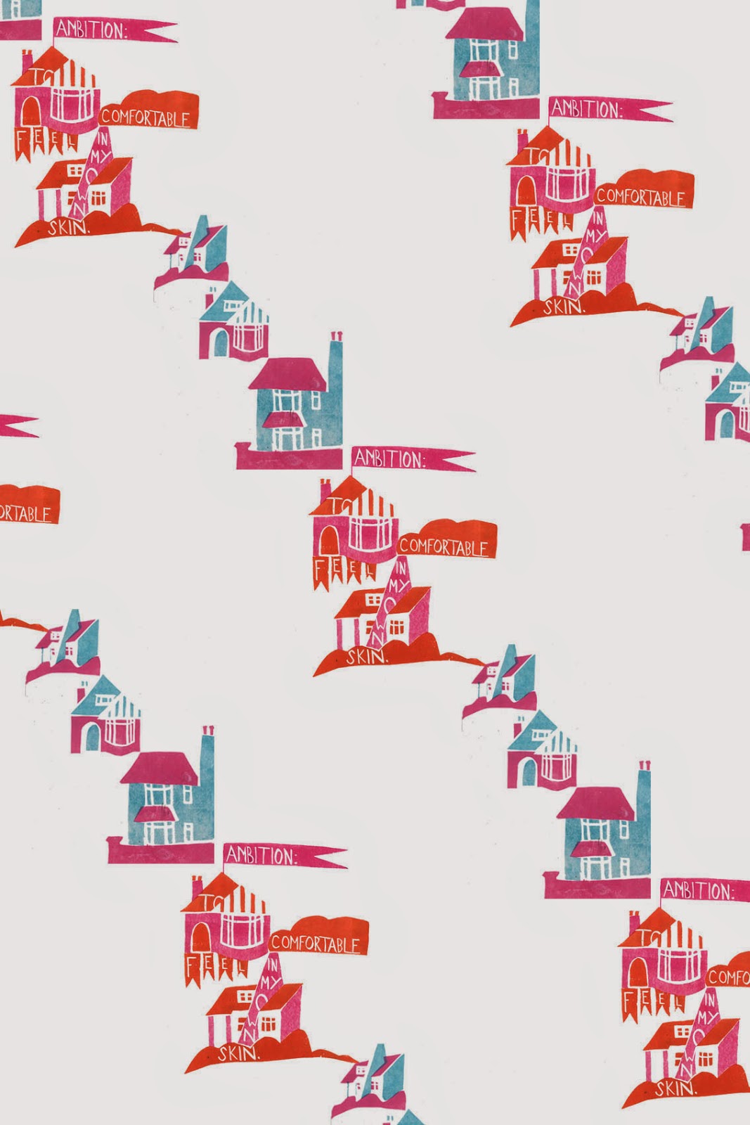
I wanted to incorporate two of my previous designs together to make a final design.


 I liked the design of the first and the mix of colours in the second so I decided to combine elements of each together.

This is the design I ended up with.


I'm going to have this printed onto wallpaper for my final exhibition. Today I'm going on an expedition to find some plain wallpaper.


Monday 19 May 2014

Monday

I've hit a stumbling block in my work where I'm very confused what to do. I'm trying to make designs to put on plates and mugs but I don't know which ideas to follow and it's very frustrating. I also don't know what to do from a style point of view - whether to have it looking drawn, or working with prints like I've been doing, or having a mixture which is just getting confusing. I've been trying to do thumbnails but they just have a lack of focus and are not working well.

However I think I need to think about what is most relevant given the work I've done so far. What has my work focused most on? Well visually it's been all about the prints of houses, with the text arranged around them in a careful way.  Therefore this is probably the route I should also take with the designs for the plates and mugs, to keep a sense of flow through my work and stop it getting too jumbled.

However I'm already going to have printed wallpaper in the background so this could all end up looking a bit samey. I'm going to try out some more thumbnails to find the best solution.

Sunday 18 May 2014

What have I been doing (Saturday)

As a way to try and get an impression of other people's interior lives I've been asking them to send me photos of their living rooms. However after thinking about taking my project in a more personal direction, I decided to take some photographs of my bedroom. You can already see some here but my room has become even more messy since then and I think it will give an indication of my life over the past few months to look at it. This is following on from looking at found objects to represent people and their day to day lives - here is a massive 'found object' that happens to be a room.


I didn't quite realise how messy it was until I started taking pictures of it.

What have I been doing (Friday)

I was exploring the responses I got to the 3 minutes stream of consciousness writing about every day life that I got people to do, through use of found objects. The use of found objects was inspired by research on Peter Blake's collections and Joseph Cornell's boxes. I then photographed the results.

One response talked about making breakfast for the family before catching the bus, but on this particular day, the porridge they had made was unsuccessful. I explored this using a tin bowl, combined with a bus ticket onto which I added a quote from the paragraph.


I think this worked well as it combines elements of what I was trying to represent, as well as looking quite visually good due to the colour palette and simplicity. It looks at first glance a bit like a painted plate but with the added texture of the bus ticket it subverts this idea. 

I also think the use of the plate is nice as it is a very every day, normal domestic object, which links well with my theme.


I then tried representing a different response by collecting objects together in a box. The first photograph I took of it was accidentally far too overexposed but I think it gave quite an interesting effect. It creates an impression of confusion and mysteriousness.


The plainness of the box on the outside contrasted with the vibrancy of the objects inside, creating a juxtaposition between within and without like I've been exploring.


On Photoshop I then combined one of the images with the text I had based it off. I like the concept of it but I was in a rush so it's very sloppy looking. I'm going to redo it better. I really like how it works though and I'd like to keep exploring the paragraphs I've collected in a similar way. The combination of text and image complement one another visually and create a stronger impression than each in isolation.

What have I been doing (Sunday)

Following on from thinking about contrasts between 'outside' and 'within' I've been exploring this in a variety of ways. I got people to think about the photos of the windows from my previous blog post, which came up with some very interesting results. Everyone interpreted the same image in very different ways, which shows that our assumptions about a person or situation will vary depending on the viewer's personal experiences. For example everyone is likely to interpret a piece of artwork in a different way. I also came to the conclusion that I need to take more pictures in different areas to get a wider impression.

Another way I was exploring out and in was thinking about how I could create dichotomies by putting different objects inside different things. For example, putting something very valuable and rare inside a Tesco bag, or something very mundane or ugly inside a beautiful, precious looking box.

I took some pictures exploring this.


I took the beautiful ornate box and put some very mundane, worthless items in it - a dog biscuit and some old blu-tack. This creates a juxtaposition between what you would expect to be in the box and what actually is. I want to create a similar feeling of contrast with my piece in the exhibition. 

Following from this I then thought about exploring contrast, and the idea of things not being quite as they seem, in a slightly more imaginative manner. I heard that if you write on paper with milk, it creates a hidden message that can be revealed by ironing the sheet of paper to burn the milk. So this creates the illusion of a blank sheet of paper, when really there is a hidden inner message. A bit like when you first meet a person, you only see an outward aspect of them, but if you wait to get to know them, inside thoughts are revealed.

I wrote on sheets of paper using quotes from the stream of consciousness writing I collected from people. 


Here are the ironed papers:

It turned out that ironing the milk only burned parts of it, so that the message came through fragmented. I think this is a good reflection of how we can never know 100% about another person or situation and will only ever see fragments. I want to make the viewing of my exhibition quite fragmented in some way, so that the viewer has to try very hard to view and interpret it. This will help to make them think more deeply and strengthen the concept by making it closer to real life.


Wednesday 14 May 2014

Thoughts so far

After having a discussion with Trudi on how I could develop my work towards the exhibition, I've managed to consolidate the theme I'm exploring, which is going to be the dichotomy between outward appearance and inward reality. Basically it's about exploring the shallow outward presentation of a person's every day life that you see versus the realities and differences that you don't. (Ie. the outward conforming and unassuming appearance of a suburban 'cookie-cutter house' - following on from my exploration of kitsch house prints - versus the crazy reality of the lives of the people inside - following on from my work looking at people's stream of consciousness writing about their every day lives). I'll be following my new development of working in 3D.

dichotomydʌɪˈkɒtəmi,dɪ-/
nounnoun: dichotomy; plural noun: dichotomies1.
a division or contrast between two things that are or are represented as being opposed or entirely different.
"a rigid dichotomy between science and mysticism"
synonyms:divisionseparationdivorcesplitgulfchasmMore
2.
BOTANYrepeated branching into two equal parts.


The discussion also reminded me of this quote from the Great Gatsby:

“I was within and without, simultaneously enchanted and repelled by the inexhaustible variety of life.”


― F. Scott Fitzgerald


Through thinking about the idea of outward and inward appearances I've been thinking about what people put on their windowsills, which gives an impression to an outside viewer where they can draw conclusions about what that person/household/area is like. This is likely to contrast with the reality. It also links back to the work on houses that I've been exploring. Because of this, this morning I went out to take photographs of windowsills in my local area to explore this.


I'm now going to research how people make assumptions about the outward appearance of these windows by asking people in a questionnaire to think about what kind of person/family they would expect to find living in these houses.

I've also been thinking about how I want my exhibition to make people feel. Taking these pictures I felt a little uneasy and like I was snooping and that's the kind of feeling I've decided I want to create.


I also read an article recently about the new phenomenon 'shelfies' where people take photographs of their shelves to put on instagram. I've been wondering about what people's shelves can say about them. This follows on from when I was exploring taking photographs of bedrooms and seeing what they can reflect about a person. So I've been taking photos of the shelves in my home and I think I'm also going to ask people about the impressions I get from these.