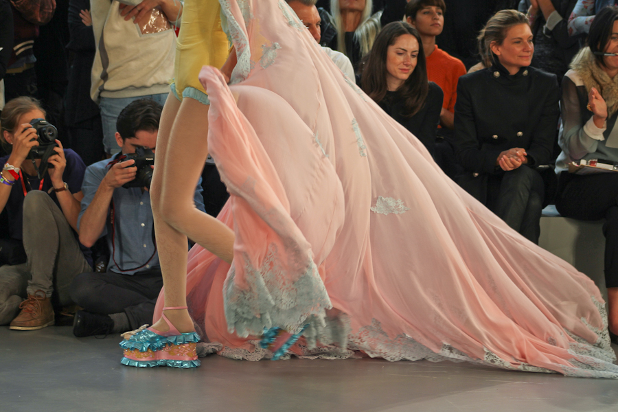
(image from vogue.co.uk)
The attention to detail and the inventiveness really makes the collection stand out. For example the idea of creating a skirt using silk flowers in mesh bags is very striking. The whiteness, cage like structures, obscuring and muffling of faces all hints at the entrapment of women by societal expectations to behave in certain ways. It is also a very beautiful collection despite being quite unconventional in terms of structure of the garments. I don't know how wearable it would be though, especially the headpieces. Also I could very definitely not afford any of this.
(Credit for these images to thecuttingclass.com)
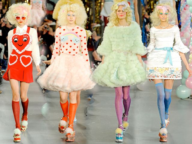
I also chose to research Meadham Kirchhoff's S/S 2012 collection (only fair haha). This was SO CUTE. I'm in love with the pastel colour scheme. I think this collection would be more wearable than the Comme des Garcons one but then again I don't think it has the same conceptual punch. I don't really know what else to say.
I think this one has to be my favourite piece ^
Also this is from Spring 2011 but look at this rainbow hair!
Meadham Kirchhoff = extremely awesome.
Comme des Garcons = extremely awesome too.


No comments:
Post a Comment