 The blue and pink design on the left is the original two colour mono print, the blue sheet in the middle is the actual stencil I used, but thought looked good and that I should work further with it, and the design on the right is the original with text added to it.
This is the repeated pattern made of the original. However I felt it was a little boring in its current state and didn't really like the colours so played around with different effects on it.
I think that this black and gold design works well because it looks quite rich and ornate. It adds a very decorative feel to the pattern. It's very dark but I think with the gold this isn't a problem.
I then tried simplifying the shapes of the design and modifying the colour palette. I like these red and green colours together as coupled with the design they remind me of rose buds. As a very stereotypical suburban theme being rose bushes, I think this works well contextually.
I then inverted the black and gold pattern, and added a diagonal criss-cross effect. I think this works well as it is a very classic kind of wallpaper pattern, but given a quirky twist by the houses. I'm a big fan of the blue and white combination as it reminds me of willow pattern pottery (another link to the domestic). The criss cross pattern balances the image.
I then put the chrome effect on the previous image. I think it has a very cool and subversive effect. It preserves the criss cross pattern whilst distorting the images themselves. This could be representative of the idea that in life the views we have of other people and situations are often a distortion of the actual truth.
This is another distortion of the blue and white criss cross pattern. I think it has quite a retro and cute effect, with the shapes looking like flowers. Again I think it works well having distorted the original design but still kept elements of it.
After this I took the original blue and white design, added a background, and then played around with different colour ways. I think they all worked pretty nicely. They have quite a classic look to them.
Next I tried working with the blue stencil print which I had scanned into the computer:
I think the contrast between the blue and the white works well. The image seems to have an appropriate level of negative space and keeping it just blue and white is nice and simple. So instead of changing up the colours I concentrated on developing it through adding texture.
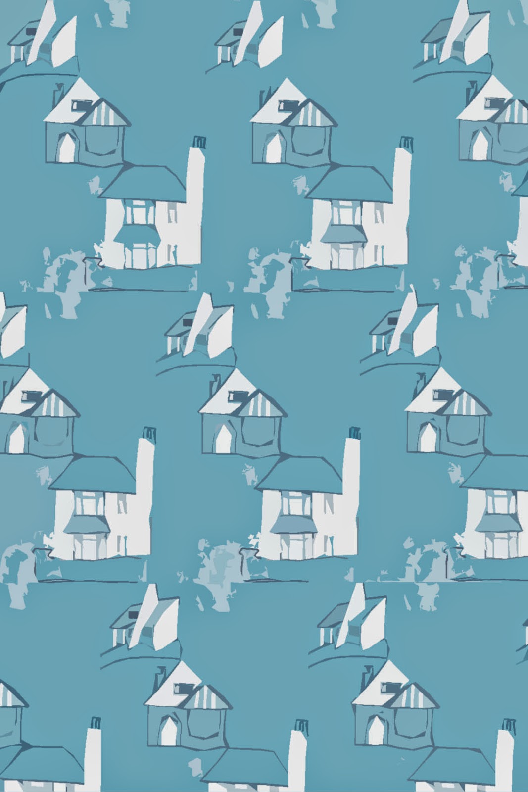
This lighter and more patchy shade of blue also works nicely. It has a brighter and more uplifting effect. The patchy texture adds interest. I then took this and simplified the shapes (see below).
I think this looks quite vintage and 1950s with its bold shapes and lines and cutesy appearance. I think the shade of blue is nice and atmospheric.
This textured version is I think really effective as it gives the illusion of destruction and decay. It adds a dark theme to the image.
I then added another texture and ended up with this (above). I really like the scratchy effect making it look rough and imperfect. I think it would work better in blue but I couldn't work out how to do this oops.
This was from taking the original and pointillising it. I love the effect this gives. It's abstract and reminds me of ripples in water. It has a very pretty look. It really adds a twist to the original design.
Finally I worked on making the edition with text into a surface pattern.
I think the addition of text (which was in the individual design thumbnail for the images) really adds to the design. It makes it look much more balanced and interesting. I'm still not the biggest fan of this colour scheme so I played around with it again. I didn't want to distort this design too much as I wanted the text to still be legible.
This colour option is much brighter and more vibrant. However it was quite hard to edit the colours so the effect is a little messy. I think it's still good however because it does add more vibrancy to an already playful image.
This all black edition looks very striking. I think the slightly messy, inky look works well in this case as it seems very organic. I do really like the boldness of this version.
I added a glow tool to the original pattern to get this green effect. After playing with the hue, I also liked this pink version. I think it works well having the houses in white against a coloured background. I then changed the colour of the pink one's background and played with hues again. I think they all look really good.
I then wanted to try a cooler background (see below). I think the contrast between the grey and red really works. I then increased the contrast substantially (second image) and I think the outline effect is very bold and works well.
In conclusion I think I came up with some really nice results. Paying more attention to negative space really pays off.


No comments:
Post a Comment