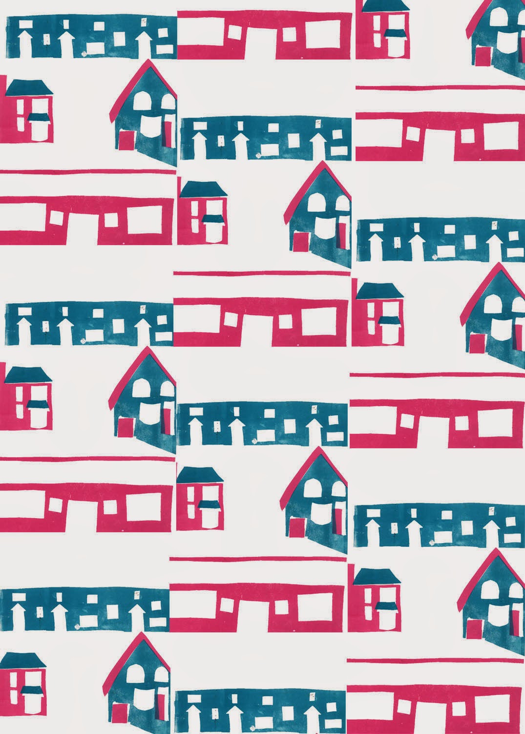
This morning I was working on these prints so that I could create a repeating pattern out of them. This is to show the monotony and repetition of suburban life. I printed the pink first then added the blue over the top. I quite like the random effect where some of the colours overlap.
I then scanned the finished print into Photoshop and experimented with it.
Here it is in its original colourway. I think the simplicity of the shapes works well but there is not quite enough nagative space, making it look quite busy. I felt the colours were too dark and dull so I brightened them, as seen below.
I think this gives a pretty effect although would work better on a pure white background (which it actually has but Blogger has messed the colours up). Having the colours lighter and brighter makes the image look less opressive and busy.
Here it is once I added a tile effect. I think it works well as it looks remininiscent of Victorian sewing samplers which adds to the homely and familiar atmosphere.
Given that the problem here is lack of negative space, I'm going to work on a different one of my thumbnails which will incorporate much more negative space.


No comments:
Post a Comment