Showing posts with label 3d. Show all posts

Wednesday, 23 October 2013

Comme des Garcons and Meadham Kirchhoff

(image from vogue.co.uk)

I decided to choose Comme des Garcons as my main designer to research and create a homage to in 3D design because I like that it is not just about clothes that look pretty but there is a lot of conceptual meaning behind them. I decided to focus on the S/S 2012 collection because I was drawn to it by the all white aesthetic. This makes it look good visually and gives a strong coherence to all the pieces together but the colour white also has a lot of symbolic associations - birth, death, marriage, purity, saintliness etc.


The attention to detail and the inventiveness really makes the collection stand out. For example the idea of creating a skirt using silk flowers in mesh bags is very striking. The whiteness, cage like structures, obscuring and muffling of faces all hints at the entrapment of women by societal expectations to behave in certain ways. It is also a very beautiful collection despite being quite unconventional in terms of structure of the garments. I don't know how wearable it would be though, especially the headpieces. Also I could very definitely not afford any of this.


(Credit for these images to thecuttingclass.com)


I also chose to research Meadham Kirchhoff's S/S 2012 collection (only fair haha). This was SO CUTE. I'm in love with the pastel colour scheme. I think this collection would be more wearable than the Comme des Garcons one but then again I don't think it has the same conceptual punch. I don't really know what else to say.
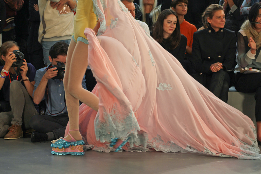
I think this one has to be my favourite piece ^
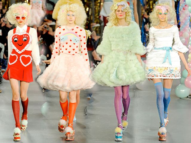


Also this is from Spring 2011 but look at this rainbow hair!


Meadham Kirchhoff = extremely awesome.

Comme des Garcons = extremely awesome too.

Saturday, 19 October 2013

3D design studio photos

For our 3D design block we have all had to make some tubes out of materials like canvas and bin bags. Once we had made them we used them as concepts for photographs. Here are the photos we ended up with in the studio.

 For these two I was directing and photographing. I quite like the composition of the first one but the lighting in the second isn't very great. I think the colour is actually important in these photos so putting it into bw probably wasn't the best idea.

I think this one worked super well! It reminds me of an old painting for some reason. I like that a lot of concepts could be interpreted behind this. For example why are we connected but facing away from each other?


 I also think this one works well; it looks like an interesting photo to look at. I think the fact that none of out faces are visible is good as it adds a sense of mystery.


Here's the whole of our group in one tableaux. This one also reminds me of a modern spin on an old painting. The richness of the colours and the sense of contrast adds to this effect.