Showing posts with label art. Show all posts

Friday, 23 May 2014

Plans for the exhibition

My initial plan for the exhibition was to use a cabinet in a dark space to represent a window (following on from my work looking at windowsills and the impressions they can give about a certain truth), with a light going on and off inside to reveal and hide the objects on the shelves within. This was designed to show how the interior truth of something is only revealed under certain circumstances.

However after a discussion with my tutors I decided that this might not be the best way of presenting my work and that something cleaner, more modern and more contextual would be more appropriate. Using a cabinet, I was in severe danger of it just looking like a cabinet, rather than a window, and in that case important meaning would be lost. The dark mahogany exterior of the cabinet was also likely to look rather dated compared to other exhibits. Therefore I've changed my idea for the exhibition to using a real window instead. I'm going to enclose one of the windows in the illustration and graphics room to create a self-contained space, inaccessible from within the room. Instead the viewer will have to peer in through the window to be able to see the exhibit. This should create a sense of curiosity and prying to echo the feeling got when looking in through other people's windows in real life.

There will be a net curtain covering much of the window to partially obscure seeing in, and either a light going on and off or a fan blowing the curtain away at intervals. As it is no longer planned be in a dark space I was at first more inclined to have the fan but I think it would be difficult to set up effectively. I also think that with the curtain obscuring the view, the light going on would make it easier to see through so the original desired effect would still be had. However for this to work I need to locate a timer that will allow me to have the light going off at appropriate intervals, for example every minute. I've yet to find one that can do that so I may need to find out how to make it myself.
Alternatively it's possible to get hold of a timer that randomly simulates lights being turned on and off to give the impression of people being at home when actually they're out. Using a timer such as this could be interesting conceptually as it simulates the impression of human activity. The randomness could add unpredictability and added interest.

The far wall I am planning to paper in wallpaper of my own design (see previous blog post). There will also be two shelves which will contain mugs and plates I have designed based on the stream of consciousness writing that I collected from people. This will represent the 'inner thoughts' of a person. I've been doing some initial designs for these.

I scanned in extracts from the stream of consciousness writing, therefore using that person's unique handwriting as well as any spelling mistakes and quirks. I think this is nice idea as it makes it seem more personal, organic and 'real' than using a more formal type of text. However because of this, some of the text is quite hard to interpret, which is especially a problem as these are going to be viewed at a distance, adding to the difficulty. Therefore I'm going to experiment with different ways of writing shortly, which are more clear. However on the other hand perhaps the difficulty in interpretatation might add to the concept of the project, as the inner truth of someone's every day life is rarely easy to interpret. I'll have to consider this when making my final decisions.


This is a design for a plate (it's just the circle in the middle). I think this extract is nice and I like the use of line drawing. However I think more could be made of the design because as it is I don't think it works brilliantly. I need to try out drawing different dogs and perhaps have a number of dogs on the same plate because that would be likely to look more interesting.


I really think the simplicity of this works well. It's designed to be printed on the side of a mug. I think it's quite dainty and would look nice. Any bigger would minimise its appeal. However because of the smallness of the text it would be extremely difficult to read from outside the window. I need to weigh these two points up.


 This plate design was based on the work I was doing with a plate last Friday (see it here). Again I really value the simplicity of this. I think the spelling mistake adds charm however it might just come across as a mistake on my part in the exhibition.


I feel this mug design works really well. The mix of block colour and line complement each other well. I'm very happy with this design as it looks dainty and charming.


I'm a fan of the use of just one colour. I'm not sure whether in the end I will have them printed in blue or in a pink shade, as it depends what I feel will complement the wallpaper better, so I'm going to wait until the wallpaper is printed to make up my mind. However I'm very attached to the use of blue as it reminds me of old fashioned blue and white crockery, which I love.

Following on from these designs I'm going to try some more so I have a range of designs to choose from when making my final selection.

Sunday, 18 May 2014

What have I been doing (Sunday)

Following on from thinking about contrasts between 'outside' and 'within' I've been exploring this in a variety of ways. I got people to think about the photos of the windows from my previous blog post, which came up with some very interesting results. Everyone interpreted the same image in very different ways, which shows that our assumptions about a person or situation will vary depending on the viewer's personal experiences. For example everyone is likely to interpret a piece of artwork in a different way. I also came to the conclusion that I need to take more pictures in different areas to get a wider impression.

Another way I was exploring out and in was thinking about how I could create dichotomies by putting different objects inside different things. For example, putting something very valuable and rare inside a Tesco bag, or something very mundane or ugly inside a beautiful, precious looking box.

I took some pictures exploring this.


I took the beautiful ornate box and put some very mundane, worthless items in it - a dog biscuit and some old blu-tack. This creates a juxtaposition between what you would expect to be in the box and what actually is. I want to create a similar feeling of contrast with my piece in the exhibition. 
Following from this I then thought about exploring contrast, and the idea of things not being quite as they seem, in a slightly more imaginative manner. I heard that if you write on paper with milk, it creates a hidden message that can be revealed by ironing the sheet of paper to burn the milk. So this creates the illusion of a blank sheet of paper, when really there is a hidden inner message. A bit like when you first meet a person, you only see an outward aspect of them, but if you wait to get to know them, inside thoughts are revealed.

I wrote on sheets of paper using quotes from the stream of consciousness writing I collected from people. 


Here are the ironed papers:

It turned out that ironing the milk only burned parts of it, so that the message came through fragmented. I think this is a good reflection of how we can never know 100% about another person or situation and will only ever see fragments. I want to make the viewing of my exhibition quite fragmented in some way, so that the viewer has to try very hard to view and interpret it. This will help to make them think more deeply and strengthen the concept by making it closer to real life.


Wednesday, 7 May 2014

Library Research

I found this article interesting because like my project, it relates visually to houses. It has a great sense of nostalgia. I'm inspired to try working in a 3D installation kind of way. Although I don't have the space to build a real size house, I might use a dolls house. I need to work out a way to do this.


This image attracted me because I liked the texture of the photograph projected on the walls. This subverts the idea of wallpaper and really builds an immersive atmosphere. Turning it upside down adds a surreal and unexpected effect. Again to explore a similar thing to this I need to try working in 3D. Perhaps first just using a shoe box or something.


I liked how Jen Moules has used stitch in her otherwise flat print work. I've been meaning to use stitch in my project and have only touched on it briefly, but this has reminded me to pursue it! I'm going to use stitch to work into one of my patterns.


Relating to my exploration of the themes of ambition and regret that I have been exploring, I found a book called 'It's not how good you are, it's how good you want to be' that I felt was interesting and relevant. It's a kind of self-help book for aspiring creatives set out in a very striking and graphical way. The design itself is inspiring as well as the messages behind it. Sticking to a black and white colour palette and bold headlines gives it a simple look and informative appearance. I also wish to use text and inspiring messages in my work, and this has shown that using boldness, straight talking and limited colour palettes will be effective.


I also looked at this book on fortune telling as it relates to the idea of destiny and brings up questions of whether our future is predetermined. If so is there any point having ambitions because what will happen will happen? Questions like this. I think this would be an interesting idea to explore and could be taken a number of ways - for example following your destiny, or overcoming your destiny, uncertainty etc. I also think tarot cards are very nice visually.


Adding text to image

Yesterday I did a print from a thumbnail I designed. Then I was adding text to it according to the design.


I felt the cut-outs worked well but I didn't like the text in pink as it makes it look a bit cluttered and messy. As a result I tried the text again with just cut-outs.


I think this version looks slightly better as it looks more coherent. This shows how if something isn't working well, it's good to go back and try again.

I then combined this print and one of my previous ones into another pattern.


I'm enjoying doing these house prints but I think I need to take it further as it's getting a bit repetitive.

Friday, 2 May 2014

More pattern experimenting

After trying out the first of my thumbnails I realised that I needed to incorporate far more negative space, so I tried making a print of a different one of my thumbnails that I felt would work better. These are the results I got from it.

 The blue and pink design on the left is the original two colour mono print, the blue sheet in the middle is the actual stencil I used, but thought looked good and that I should work further with it, and the design on the right is the original with text added to it.


This is the repeated pattern made of the original. However I felt it was a little boring in its current state and didn't really like the colours so played around with different effects on it.


 I think that this black and gold design works well because it looks quite rich and ornate. It adds a very decorative feel to the pattern. It's very dark but I think with the gold this isn't a problem.


I then tried simplifying the shapes of the design and modifying the colour palette. I like these red and green colours together as coupled with the design they remind me of rose buds. As a very stereotypical suburban theme being rose bushes, I think this works well contextually.


 I then inverted the black and gold pattern, and added a diagonal criss-cross effect. I think this works well as it is a very classic kind of wallpaper pattern, but given a quirky twist by the houses. I'm a big fan of the blue and white combination as it reminds me of willow pattern pottery (another link to the domestic). The criss cross pattern balances the image.


 I then put the chrome effect on the previous image. I think it has a very cool and subversive effect. It preserves the criss cross pattern whilst distorting the images themselves. This could be representative of the idea that in life the views we have of other people and situations are often a distortion of the actual truth.


 This is another distortion of the blue and white criss cross pattern. I think it has quite a retro and cute effect, with the shapes looking like flowers. Again I think it works well having distorted the original design but still kept elements of it.

After this I took the original blue and white design, added a background, and then played around with different colour ways. I think they all worked pretty nicely. They have quite a classic look to them.


Next I tried working with the blue stencil print which I had scanned into the computer:
 I think the contrast between the blue and the white works well. The image seems to have an appropriate level of negative space and keeping it just blue and white is nice and simple. So instead of changing up the colours I concentrated on developing it through adding texture.


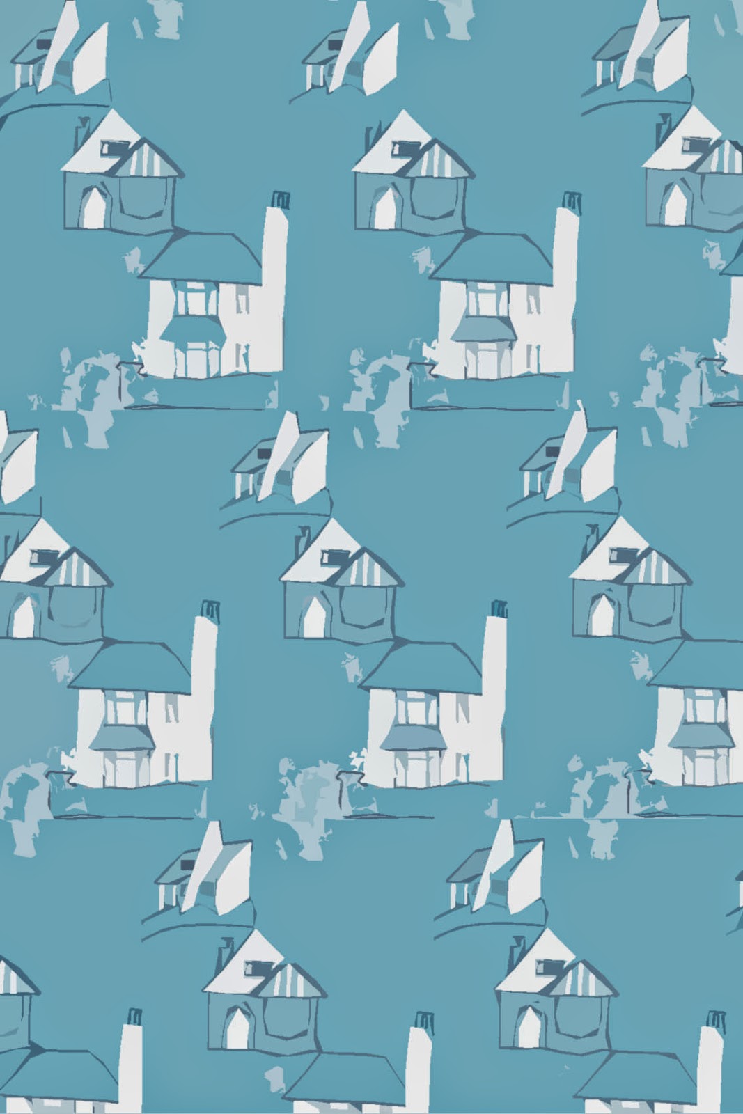
 This lighter and more patchy shade of blue also works nicely. It has a brighter and more uplifting effect. The patchy texture adds interest. I then took this and simplified the shapes (see below).

 I think this looks quite vintage and 1950s with its bold shapes and lines and cutesy appearance. I think the shade of blue is nice and atmospheric.


This textured version is I think really effective as it gives the illusion of destruction and decay. It adds a dark theme to the image.


I then added another texture and ended up with this (above). I really like the scratchy effect making it look rough and imperfect. I think it would work better in blue but I couldn't work out how to do this oops.


This was from taking the original and pointillising it. I love the effect this gives. It's abstract and reminds me of ripples in water. It has a very pretty look. It really adds a twist to the original design.

Finally I worked on making the edition with text into a surface pattern.


I think the addition of text (which was in the individual design thumbnail for the images) really adds to the design. It makes it look much more balanced and interesting. I'm still not the biggest fan of this colour scheme so I played around with it again. I didn't want to distort this design too much as I wanted the text to still be legible.

 This colour option is much brighter and more vibrant. However it was quite hard to edit the colours so the effect is a little messy. I think it's still good however because it does add more vibrancy to an already playful image.


This all black edition looks very striking. I think the slightly messy, inky look works well in this case as it seems very organic. I do really like the boldness of this version.


I added a glow tool to the original pattern to get this green effect. After playing with the hue, I also liked this pink version. I think it works well having the houses in white against a coloured background. I then changed the colour of the pink one's background and played with hues again. I think they all look really good.


I then wanted to try a cooler background (see below). I think the contrast between the grey and red really works. I then increased the contrast substantially (second image) and I think the outline effect is very bold and works well.


In conclusion I think I came up with some really nice results. Paying more attention to negative space really pays off.