The doctor sent me for a pregnancy test because I complained of a sore throat. I think the mix of image, text and background looks good together as well as the mix of line thickness and the colour combinations. This page was inspired mainly by David Fullarton's work (see example below).
David Fullarton.
This one also took influences from David Fullarton's work - particularly how he often makes lists and that his work is very personal to him. I'm not sure if I like this page but the mix of backgrounds and media is interesting and different to how I would normally work, which is good as it will stretch my abilities.
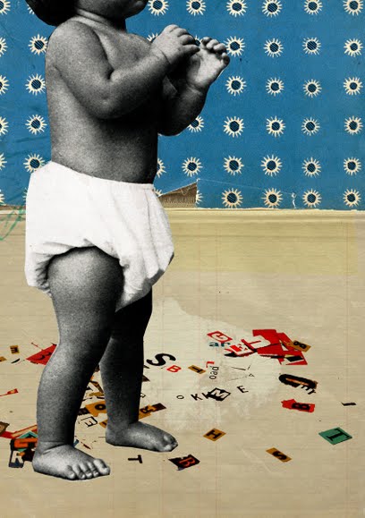
Here I was experimenting with collage inspired by the work of Michelle Thompson (see below). I wanted to make it look really bold and fill the page since this is a way in which I'm not really used to working with collage. I think the effect was pretty good. My main problem with collage is that it doesn't seem to me very original or personal. So I want to try using it in combination with my own drawing and writing.
Baby Steps, Michelle Thompson
This is a quick sketch of the Atomium. I think the black lines and spheres contrast well with the pink stripes. This combination was inspired by Cycling in London by Anna Steinburg (below). I want to try a similar thing using watercolours and black ink.


No comments:
Post a Comment