Then yesterday afternoon I ventured out into Chesterfield to take some photos with a similar strategy. It was such a beautiful day so I'm glad I went out.
I took this photograph because I was attracted to the bold repeating shapes. I like how the very dark areas contrast with the white of the clouds. The bendy spire in the background is also a bonus.
I love all the boldness and sharp edges in this as well as the contrast between the red brick and the blue sky. I think in some ways the image is quite unsettling due to the broken window and odd telegraph pole or whatever that is. Anyway I think it works pretty well.
I was attracted to this because of the boarded up window and hadn't even noticed the two little old ladies walking past. I'm not sure about this image though, it's perhaps a bit boring. But I think it's more interesting for being in the long strip shape rather than just regular proportions.
I really think this image works well, in fact it is one of my favourites I have EVER taken. The colours, composition, text on the van and glimpse of the market in the background all work together to create a good atmosphere. It really gives the impression of a lovely sunny day.
I don't know if this really works compositionally but I love the colours and the flowers are pretty so there ya go.
I like that there is a lot going on in the image and how the window and door frame it. The composition works well but I think the colours don't really. There's too much beige going on.
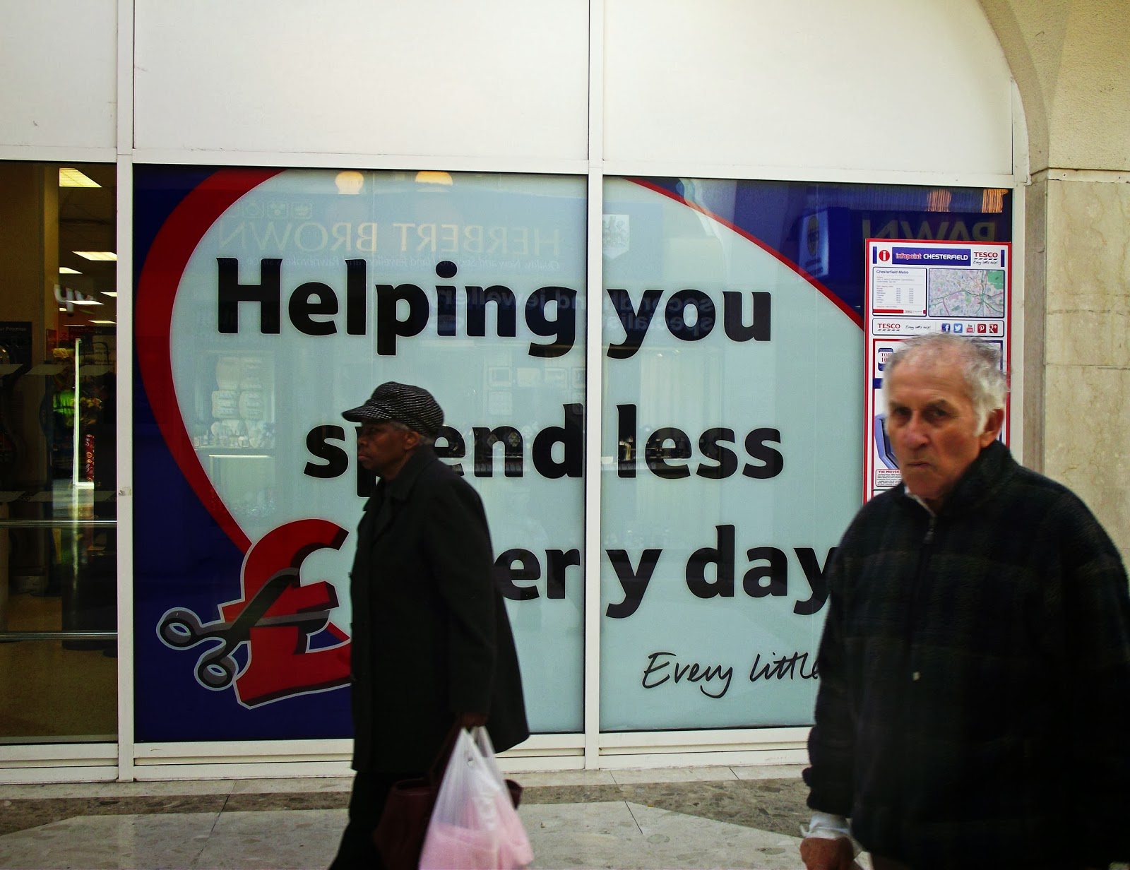
I was just taking a picture of 'helping you spend less every day' because um every day. But then these two randomers wandered through my picture which was BRILLIANT. I love the old man's sour expression. It turned out way better than it would have been.
The lighting in this isn't great but I like the composition and some of the colours. It captures a lot of people just doing every day things.
I think the colours and the graphic shadows in this work well.
So anyway that's what I got up to.


No comments:
Post a Comment