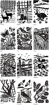
Yesterday I was doing prints based on a photo I took (see it here). The route I've decided to go down is to explore the themes of suburbia and dullness - those boring houses and having nothing to do. After doing several thumbnails this was the image I decided to focus on. I was doing mono-prints again because this has been really working for me and I'm trying to refine my use of it further. I'm getting more complicated every time I try it, until I get really good at it. It's also because I've been looking at the work of print artist John Hinchcliffe, who uses one colour mono-printing to great effect (see below). I want to emulate his bold but detailed style using the same method, although I'll be trying out with both one and two colour prints.
Months of the Year, John Hinchcliffe.
Mono-printing also suits the bold, graphic, flat style I'm trying to achieve, inspired by the work of Sheffield printmakers Jonathan Wilkinson and James Green.
Doing the stencil was super fiddly! Here's the stencil I made. I think it looks really good in itself. I like the mix of block colour and line. I'm definitely going to do some proper work with this in mind, using collage and pencil or fineliner.
Here's the first one-colour print. I think it looks good as it is as a really simple striking design.
I added an extra dimension to it by collaging with brown paper. The original plan was going to be to just print this on but I decided to try this out as well. It gives a nice muted effect. I'm now going to experiment with adding more colour to it, probably with the oil painting method.
Here's the printed version. I think it works really well because it's very bold and the limited colours contrast with each other well. However I decided to try it with a different colour palette to see how it turned out.
So I did a different version of the original stencil in orange. Because the stencil already had black ink on it this made an interesting effect. It's good how it adds texture and depth to the image in a subtle way.

I then added pink to the orange base. I think this colour scheme also works really nicely. It's more vibrant and cheerful than the black and orange. It doesn't have the same level of contrast though, which I suppose can either be a good or bad thing depending on the situation.
I now want to experiment with adding text to my prints, to add to the design and also the concept.


No comments:
Post a Comment