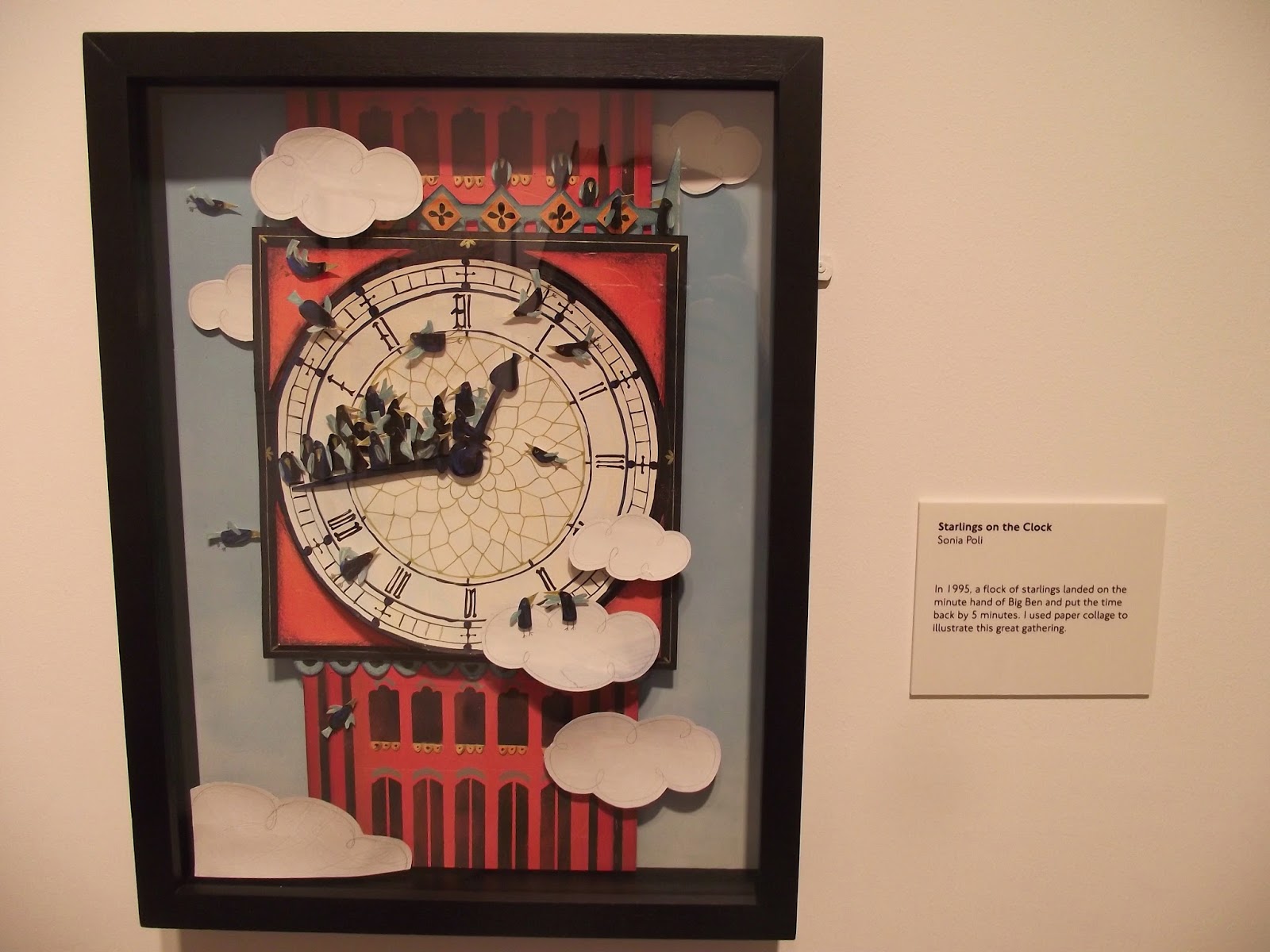
There were two pieces that stood out for me, by the artists Anna Steinberg and Sonia Poli. After researching their work further I've found even more to inspire me!
The Great Fire of London, Anna Steinberg
I love the limited colour palette of this piece, the block orange of the flames contrasting with the white of the paper and the black of the pen. It's stylised but extremely evocative. The mix of flat, bold watercolour and delicate scrawling pen works extremely well, as does the portrayal of text by both typewriter and contrasting handwriting. I love how full of interest the page is whilst still leaving quiet areas. There is so much to read and look at and it builds up a very thorough picture. This strikes a chord with me because I like to write all over my work too.
After researching her work further I found that she's entered the Serco Illustration Prize before. This one was from the Year of Cycling and is my favourite of the others.
Cycling in London, Anna Steinberg
Again I love the contrast of the boldness of the watercolour and the delicate pen work. The use of one colour and black really works well so perhaps this is something I should try. The composition is also great. I love the person's head just coming in on the bottom!
This next one is from her personal work. I really liked its energy and intensity.
Modern Willow Pattern, Anna Steinberg
I love this twist on traditional willow pattern. Unlike the traditional calm pastoral feel of willow pattern you can almost feel angst seeping from this. Again the combination of text and image is something I like. Painting on a paper plate is really imaginative and quirky and also creates an interesting effect as you have to work circular rather than on a rectangle as expected. I want to try and work on interesting materials like this. It feels like a very personal artwork.
Starlings on the Clock, Sonia Poli
Sonia Poli's work was another that I liked in the exhibition. I love the 3D paper modelling of this piece. It builds up a really evocative picture and the shadows cast really add realness. It's also a pretty funny story. The limited colours and bold shapes work well. I'd really like to give some 3D paper work a go. I wasn't really a fan of Sonia Poli's other work though, when I researched it online. It's very much graphic design based which isn't so relevant for me. Also her website was horribly confusing and difficult to navigate!


No comments:
Post a Comment