Tuesday, 29 April 2014

Print experimenting


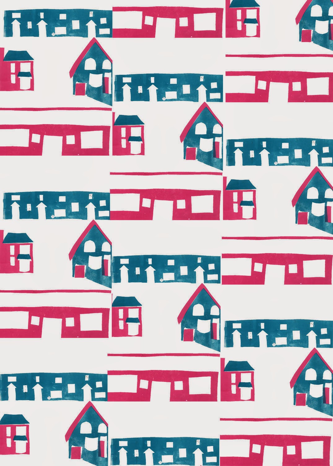
 This morning I was working on these prints so that I could create a repeating pattern out of them. This is to show the monotony and repetition of suburban life. I printed the pink first then added the blue over the top. I quite like the random effect where some of the colours overlap.

I then scanned the finished print into Photoshop and experimented with it.


Here it is in its original colourway. I think the simplicity of the shapes works well but there is not quite enough nagative space, making it look quite busy. I felt the colours were too dark and dull so I brightened them, as seen below.


I think this gives a pretty effect although would work better on a pure white background (which it actually has but Blogger has messed the colours up). Having the colours lighter and brighter makes the image look less opressive and busy.


Here it is once I added a tile effect. I think it works well as it looks remininiscent of Victorian sewing samplers which adds to the homely and familiar atmosphere.


 Just two more experiments with different colours, although Blogger has utterly messed them up so that they're almost unrecognisable.


Given that the problem here is lack of negative space, I'm going to work on a different one of my thumbnails which will incorporate much more negative space.


Monday, 28 April 2014

Surface pattern experimenting!

Today I was working with some of my existing prints to make patterns by scanning them into Photoshop, and then playing around with them. They were inspired by 1950s fabric prints. Here are the results.

This is the first I tried. I think it doesn't work hugely well because it's too busy and there's a lack of negative space. I need to remember to factor in negative space in my later prints.


Then I tried changing the colour of the one above. I like this colour scheme too because it is very vibrant and bold, and quite pretty.


I then developed this by distorting it. I like the effect this gives because it is pretty and reminds me of blending ink. It also reminds me of Ted Baker prints which is always a bonus!


The next pattern I made was this. I think this works better as it has far more negative space. I also enjoy the simplicity of the shapes. I get a really kitsch 1950s feel from this print. I think the colours are good because they seem very happy and vibrant. However I decided to try experimenting with colours to try different effects.


I manipulated the colours to get this outcome. I think the blue is nice but the black is a little oppressive, although I really think the selective palette has a very good, simplistic effect. As a result I tried replacing the black with white.


I think this also works well, with the lighter feel looking fresher and less gloomy, however I wanted to add some subtle colour in the background.


I think the pastel blue and yellow look sunny and retro together, like the effect I was trying to create. However I wanted the image to look even  more simple, to become more striking and abstract, so I simplified it.


The muted blue scheme reminds me of Dutch pottery design. It has quite a calming and serene appearance. I think the simplification and abstraction adds to the 50s feel.


These were just playing around with the hue. I think keeping the colour muted is good as it looks calming and retro. The simplicity of the shapes is nice.


The final print I made was using a similar starting point - ie. the same print but a different edition:

This is much bolder in colour scheme. I think it does work well but is a bit busy, and the first variation I did works better.


I used the 'glowing edges' effect to simplify the image. I like this but I think the colours are a little bit clashy. As a result I took the colour away to leave just white lines.


I really like this effect. But I thought if used in large doses the black could again look too oppressive, so I tried inverting the colours.


I think the sketchy effect looks cool. It's very simple but still obvious to see what the subject is.


I also played around with the colour of the original to see what just one colour would look like. I think this has a nice effect but that the original colours complementing each other work better, as it helps to differentiate the different areas of the image. So to finish, I just experimented with the hue of the original image.


These colours seem really vintage, striking and 50s to me which I think works great. They also add a sense of unreality and quirkiness which I like.


My next step is to design a new print design specially, bearing in mind what I've learnt from this exercise. I'm then going to mono print it.

Tuesday, 15 April 2014

A collection of thoughts

So in 2011 I went to see the Photography Degree Show at Sheffield Hallam University and there are two images that have stuck with me ever since. First was this one by Tom Archer:


It's a photograph that really made an impact on me because of its familiarity and humour. Coming to think of it, I think it's been a factor in me choosing the theme of every day life and wanting to explore similar events and happenings. The title of his degree show was 'Nothing New' and this is what he wrote about it:

"These are the moments of human life that would not be deemed spectacular or extraordinary by any bystander, but to the photographer offer ambiguous, obscure or even sublime moments that once seen, are never forgotten.
These photographs are observations of everyday life, insignificant “non-moments” belonging to the individual alone: non-moments when the private self is unconsciously revealed, given over to the act of simply existing.
Nothing more
Nothing new."

This kind of sums up some of the ideas I've had about my project. Anyway I thought it would be good to share as it's had an impact on my work so far and no doubt will continue to do so. I took a look at some of his other work (which you can see here) however I actually found it all deeply uninspiring and bland.


The other piece that I remember from the exhibition was by Lucy Oldfield (I also looked for more of her work but she seems to have vanished without a trace).


Anyway I just remembered that she had used a dolls house in her work and that it gave a very domestic every day feel. I like that you can see the carpet and wall behind it that makes it very clear that it is a model and not real. It's good how you can see into a lot of rooms at once and there is a lot going on. 

This got me also thinking about an article I had read recently about photographer Michael Paul Smith working with model buildings and cars, who unwittingly created a 'dream like reconstruction' of the town he grew up in. They contrast with Lucy Oldfield's work with the dolls house as far from being presented as models, the scenes look super realistic. This feeling of nostalgia is something I've been wanting to explore in my work and also relates to George Shaw's paintings of his home area in Coventry. You can see the whole article and pictures HERE but here are a few of his photos.


Bearing both the work of Lucy Oldfield and Michael Paul Smith in mind, I decided to take some photos of dolls houses for my project. I think this works really well with the ideas of the every day, domestic and nostalgia as they take the form of houses and are childhood toys. They also sort of reflect the idea of dullness as I used to play with them when I was bored and had nothing to do.

I did a mix of shots, some very obviously a dolls house and some trying to be more realistic.


This isn't very well framed or composed or anything but I was just trying to get an idea of all the rooms and the structure. When my mum was 5 she got this dolls house at a school jumble sale for like 10p and then I had it when I was a kid and painted all over the nice vintage wallpapers and ripped it apart so its in a really terrible state.


I really like the composition of this one. I love the sense of depth and height. It looks quite grand in a wierd sort of way. I think the run down look of it is pretty cool.


I also think the composition of this works well - being able to see above and below the floors. The blue tones are nice. When we were little, me and my best friend used to think this room had refrigerating properties (don't ask).


I like the light spilling out onto the floor. Slightly boring image though.


I think this one works really well. It's quite realistic and the framing from the window looks interesting. 


I like this photo as it looks quite realistic and yet surreal. It depicts a very every day environment yet it's also quite uncanny.


The shadow on the wall reflecting the wire design looks good. I like the intensity of the colours.


This has a very old fashioned, vintage feel to it. I love the dulled colours and combination of blue and brown.


These are two different compositions on the same scene, to try out which works better. I think the second image is better as having the blue negative space at the top helps to balance the image. Also the portrait format just seems to work better for the collection of objects.

I enjoyed taking these photos. I want to continue using dolls houses in my work as I feel it works really well with my theme and where it is heading. Creating a sort of installation out of one of them (probably the wrecked one) could work really nicely. I'll have a think about how to achieve this.




Sunday, 13 April 2014

Developing printmaking

I've been developing my prints through adding text and playing with colour. The first thing I tried was adding lettering with the printing blocks. However it didn't really work that well because I was trying to print onto a photocopy and the ink didn't stick properly. I also tend to prefer a bolder appearance so I tried a different method of adding text later on (see below).


I then used the oil method to add colour to a black and white photocopy of my print. I don't really think this method is appropriate in this case as it gives very muted colours and I think this print would be complemented by more vibrant ones. So I tried other methods of adding colours.


I then played with collaging a background onto the original print. Although it gives an interesting effect I think it looks too fussy and doesn't look good with the very simple block shapes. As a result I decided to try adding a simple block colour background instead.


Here it is with the simple block colour. I think the selective colour palette works well. The design looks bold, simple and quite retro. I think it has a lot more impact.


I then tried adding simple line in pencil because I'd liked the combination of line and block shape on the stencil (see previous post). I also added text using paper cut outs. I really think the addition of text has added interest and vibrancy to the image as well as balancing the colour palette. I'm still undecided as to whether adding the lines has improved it. I want to do more different prints adding text to them to create a bit of a series.


Wednesday, 9 April 2014

Printing Tuesday!

Yesterday I was doing prints based on a photo I took (see it here). The route I've decided to go down is to explore the themes of suburbia and dullness - those boring houses and having nothing to do. After doing several thumbnails this was the image I decided to focus on. I was doing mono-prints again because this has been really working for me and I'm trying to refine my use of it further. I'm getting more complicated every time I try it, until I get really good at it. It's also because I've been looking at the work of print artist John Hinchcliffe, who uses one colour mono-printing to great effect (see below). I want to emulate his bold but detailed style using the same method, although I'll be trying out with both one and two colour prints.

Months of the Year, John Hinchcliffe.


Mono-printing also suits the bold, graphic, flat style I'm trying to achieve, inspired by the work of Sheffield printmakers Jonathan Wilkinson and James Green. 

Doing the stencil was super fiddly! Here's the stencil I made. I think it looks really good in itself. I like the mix of block colour and line. I'm definitely going to do some proper work with this in mind, using collage and pencil or fineliner.


Here's the first one-colour print. I think it looks good as it is as a really simple striking design.


I added an extra dimension to it by collaging with brown paper. The original plan was going to be to just print this on but I decided to try this out as well. It gives a nice muted effect. I'm now going to experiment with adding more colour to it, probably with the oil painting method.


Here's the printed version. I think it works really well because it's very bold and the limited colours contrast with each other well. However I decided to try it with a different colour palette to see how it turned out. 


So I did a different version of the original stencil in orange. Because the stencil already had black ink on it this made an interesting effect. It's good how it adds texture and depth to the image in a subtle way.


I then added pink to the orange base. I think this colour scheme also works really nicely. It's more vibrant and cheerful than the black and orange. It doesn't have the same level of contrast though, which I suppose can either be a good or bad thing depending on the situation.


I now want to experiment with adding text to my prints, to add to the design and also the concept.


Monday, 7 April 2014

This Morning's Developments

I worked on developing a black and white photocopy from my sketchbook by adding colour with a special technique used by the illustrator Alexis Deacon. It involves using oil and then painting on the back of an image so muted colour shows through.


At first I was using acrylic paint but then I started using soft pastel because I wanted to be able to smudge it. I really liked the effect that I got. I'm going to bear this in mind when wanting to add colour to images in the future.

I also experimented with doing blind drawings of blind drawings, to get a similar but more abstract effect to the original image.


I did this in my book and then drew the last one onto a napkin, because I've been experimenting with drawing on toilet paper and I like the effect. 


It was good because the napkin is a hard surface to draw on which distorts the line, making it more abstract. I like how it gives the impression of a flowering branch without being explicit. It gives an illusion of energy.

I then photocopied this in black and added text to follow on from the workshop on text we did on Friday. I also added text to a photocopy of one of my oil coloured drawings.


 I think it works well how the delicate floweryness contrasts with the bold text. However I don't think they work very well as images as they don't really make very much sense. I think this shows I need to use text in more obvious contexts, which is what I'm going to do next.