
Showing posts with label 2D design. Show all posts
Showing posts with label 2D design. Show all posts
Friday, 20 September 2013
Dawn Dupree

Colour Work
Yesterday we were working from still lives and experimenting with colour. We tried different drawing techniques like using our left hands, not looking at the paper, and drawing with ink on a stick and masking tape. This gave a very abstract effect. Here is one of the pieces I did.
 I like how the colours worked out because they look delicate but vibrant. I think that the different colours and media work well together. I also think the drips from the ink give a good effect.
(It's meant to be a rabbit btw)

(It's meant to be a rabbit btw)
Wednesday, 18 September 2013
Photo edits


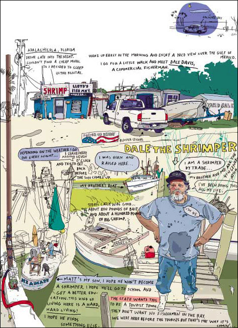
Olivier Kugler

Timorous Beasties Wallpaper and Textile Design


This one reminds me of Victorian floral wallpaper but the use of acid bright colours and a slightly more disordered design also makes it look modern and different. I think the colour palette has been very carefully considered as the colours all complement each other nicely.
Stefan Sagmeister Graphic Design
For two weeks we are going to be exploring 2D design. There are four disciplines which are Illustration, Graphic Design, Textile Design and Animation. We have been asked to research the work of some artists and designers. Stefan Sagmeister is the first one I researched.
 I like this piece because of the combination of text and image. In fact the image itself is used to create the text using the branches of the trees. I like that there is also a strong message behind the piece about not waiting for the future to be better but to seize the day. This works well as it seems to be an advert for a school of visual arts and it could make the viewer feel like they will be able to immediately improve their future by joining the art school. The way that the tree branches create the text could also catch the eye and appeal to creative people, which shows how it is meeting its target audience.
Although it is an advertisement it could also stand alone as a piece of artwork because the image has been very carefully considered. The message could also be interpreted in lots of different ways depending on the viewer.
 I think this image is interesting because of how Sagmeister has used the unconventional material of a flower to draw his text onto rather than something ordinary like paper. The contrast between the pristine whiteness and neatness of the first image and the wilting and destruction of the second creates a strong visual effect as well as meaning behind it. The first image on its own would seem to be romantic and because it has been been photographed, kept the same way forever, linking with the concept of 'always'. However in the second image the text has been destroyed by the wilting process and the flower is dieing. This gives an idea that actually there is no such thing as 'always' and that nothing lasts forever.

I like how this piece also uses unconventional materials and the contrast of textures it makes, for example, the rough, brittle straw and the shiny, smooth horses. I also think the choice of colours is good because it gives a very strong look and atmosphere. Again this piece seems to link to the theme of 'always' not lasting forever, because the lettering is made of straw or hay, which the horses are coming towards, and if they were real, the text would soon be eaten and destroyed.

Although it is an advertisement it could also stand alone as a piece of artwork because the image has been very carefully considered. The message could also be interpreted in lots of different ways depending on the viewer.


I like how this piece also uses unconventional materials and the contrast of textures it makes, for example, the rough, brittle straw and the shiny, smooth horses. I also think the choice of colours is good because it gives a very strong look and atmosphere. Again this piece seems to link to the theme of 'always' not lasting forever, because the lettering is made of straw or hay, which the horses are coming towards, and if they were real, the text would soon be eaten and destroyed.
Subscribe to:
Posts (Atom)