Showing posts with label project. Show all posts

Friday, 28 March 2014

Bypass printing development

This was one of my prints from Tuesday. I decided to develop it by adding more texture through bypass printing, from existing pages in my sketchbook.


I like how the stripes interact with the images underneath. I accidentally made the scale of the photocopy a bit larger than I was expecting. I think it's good having the line drawing of the Atomium alongside the white silhouettes underneath.


This one went completely wrong compared to how I wanted it to turn out. I had the sketchbook completely the wrong way up so ended up getting the image on its side rather than the correct way up. But in a lot of ways this is more interesting. I don't think the composition really works though. I don't really like how hard it is to ensure you get a desired effect using bypass printing.


Again this wasn't quite how I expected this image to turn out. However I think the texture of the receipt works really well on the background. It looks very ephemeral. 


I got a bit tired of the unpredictable nature of bypass printing so for this one I was just writing over the top of a photocopy of the original print. I think the texture it creates is nice.

I think the main problem with these images is the large expanse of red ad it seems quite oppressive and busy visually. I want to look at taking some of these images and incorporating more negative space.

Wednesday, 26 March 2014

Contrasts

So I was walking my dog around my area and just thinking about how weird some of the architectural and social juxtapositions are. These are all photographs taken of houses on the exact same road but with some big differences between them. Some of the most expensive houses in the city are combined with local authority housing. These are houses that reflect each other while at the same time contrasting hugely. I wanted to combine images together to illustrate this and the different every day lives of people living in very close proximity.

They're just iPod pictures so they're not great quality but at this stage it's more about the idea and the combination of images than the images themselves.

.

I like how the two trees mirror each other in this set of photos. It adds a sense of flow, while the actual buildings are really different to each other. Having the images different sizes adds interest.


I put these two images together because I felt the triangular roofs echoed each other, whilst again the buildings themselves are completely different in style. 


 I took these two because they're both bungalows but completely different in style. They look pretty boring together though.

 These were two houses right next to each other that contrast. However although they are completely different eras and styles, their overall shape and silhouette sort of mirrors each other which I thought was interesting. I wonder if this is coincidence or if it was intended by the architect of the second house. Anyway it shows a kind of coherence through time. They're very grey photos together though.


I want to continue looking at this theme. Firstly by taking more and better photos - probably with a camera this time. I could work towards making a photobook or something. I could also work with drawing houses. As well as this I could follow the idea of contrast and similarity by drawing over the photographs on acetate or tracing paper or other translucent medium so that both aspects can be seen at the same time. I could also try drawing with sewing over the top.


Room photos

I've been thinking about profiling people and their every day lives. I wanted to look at objects or things that can tell a lot about a person, based on Peter Blake's painting 'Footsteps' where it seems that the contents of someone's pockets have been spread out on the floor and documented. I was thinking about the contents of other things that could be photographed to give a similar idea of a person. For example, wallets, bags, cars, wardrobes etc.

After looking at the work of Martin Parr, particularly his collaboration with David Meadows on 'June Street', and Richard Billingham's work photographing his family in their home, I was thinking about how people's home environments and the objects in them can really reflect the people themselves. People's bedrooms in particular can be very personal and give a strong impression of a person's character and reflect their every day life. This led me to the idea of photographing and documenting people's rooms to build up a profile of them. It was also inspired by this article I saw (click here) about childrens' bedrooms around the world, which shows a lot about their individual situations.

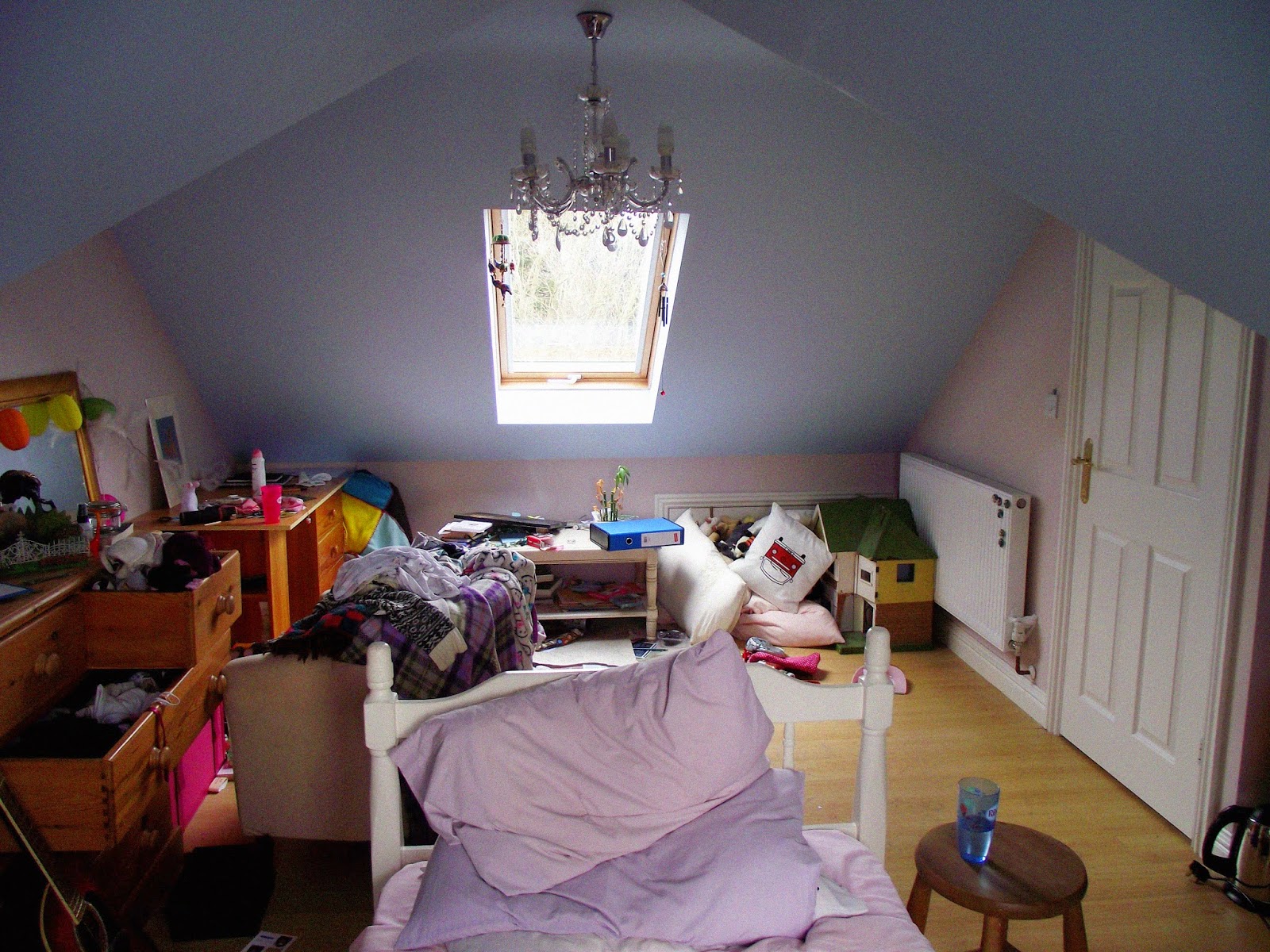
Here are some photographs that I took of mine and my brother's bedrooms respectively. The main rule was not to move or change anything so as to be completely truthful and authentic. I took pictures of the rooms as a whole and then details.


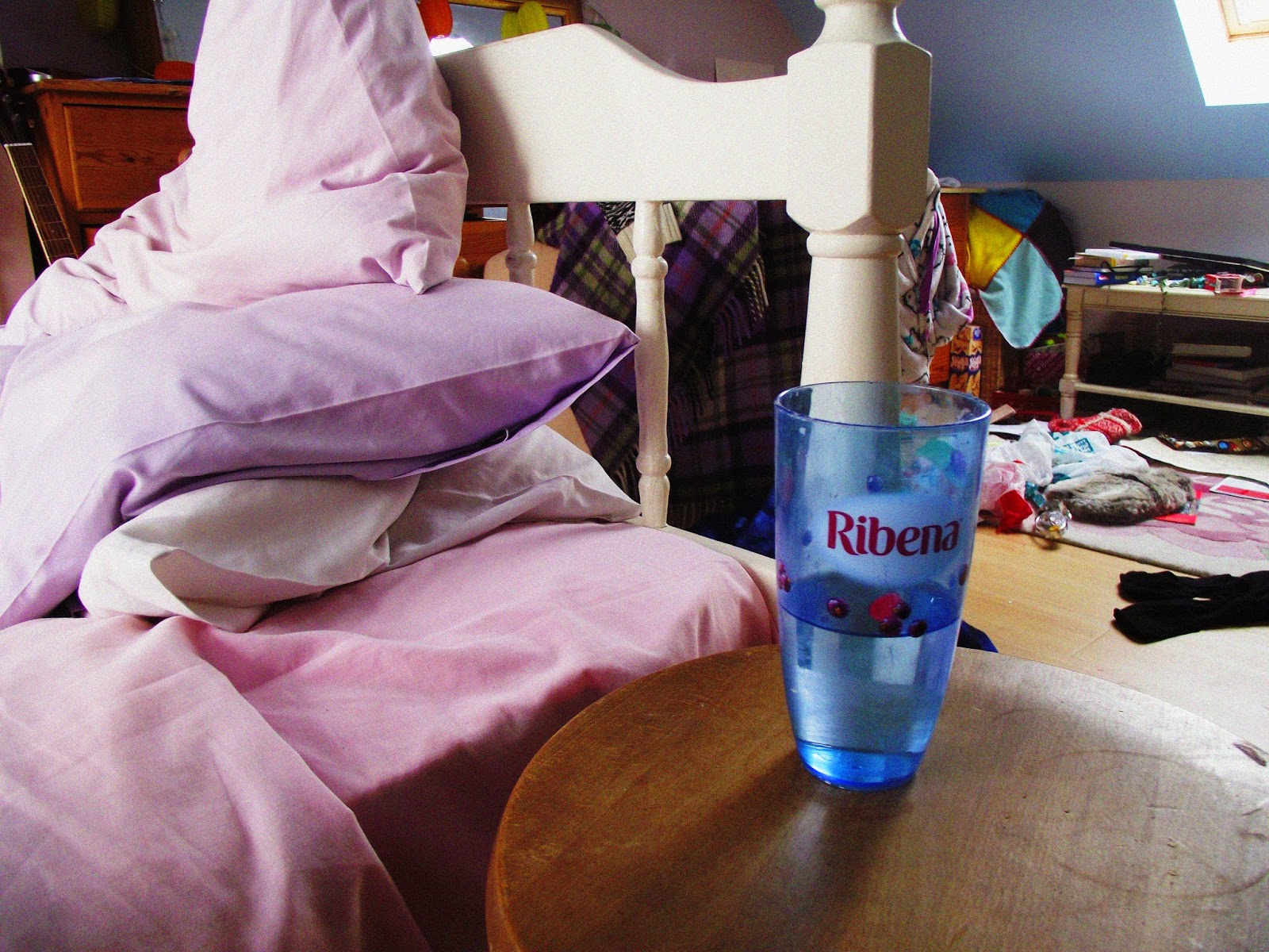
I discovered that I have a large collection of Ribena cups:


Then moving on to my brother's bedroom:


I based the saturated effect of these photos on those of Martin Parr. I was aiming for a richness of colour and tone which I think I pretty much achieved (although Blogger has messed up some of the light levels AGAIN). I think I've succeeded in documenting aspects of our personal lives. Next I would like to explore more people's bedrooms to build a collection and wider spread of images. I'm going to photograph my parents' bedroom next. I suppose having two people having a room would affect the personality of it. I also want to photograph people in their rooms to give an even more thorough representation and better profile of the people in question.

Developing observation drawings on Photoshop

Inspired by how Olivier Kugler draws and then later adds colour digitally I wanted to try adding colour to my drawings on Photoshop. These are just some quick (and not very neat) experiments at doing this.


Morrisons cafe drawings. I think using a few select colours really brings out the atmosphere. But having large areas of strong colour can look a bit oppressive. I've noticed Kugler generally tends to stick to adding colour to smaller details. I should probably look at doing this.


 Vintage London bus. I think leaving the white negative space areas works well as it stops it from looking too much. I like the black accents as well as they seem to add depth.


For this one rather than Kugler I was inspired by Sami Kronk and her drawing in white on a coloured background. I think it looks okay but messing around with the colours has had a negative impact on the line quality.

Tuesday, 25 March 2014

Printmaking

This afternoon I've been in the printmaking room starting to develop some of the images from my sketchbooks. I wanted to do printing as its kind of outside of my natural comfort zone so it could be interesting. I also wanted to push myself to work with block colour so printmaking was a good option. 

I like in this one how the ink is quite thin so you can see through to the images below. I think it could do with some development though as the composition doesn't quite work at the moment. I'm going to try some bypass printing with the photocopier on Friday.

I really don't think this one works as there is far too much black involved. The composition is also kind of messy and not working for me. I do like the different thicknesses and shades of ink though as it adds interest.

This one didn't quite print correctly on one side. However I think the mix of stripes and circles works well. I quite like the selective colours although they kind of remind me of pirates. I want to try and work back into this one too.

The simplicity of this one is quite nice. I like the orange as it looks happy and like a sunset. I might just leave this one how it is as I feel adding anything might spoil its appeal.

This one is my favourite. I love how the bold stripes interact with the lettering and collage. The red contrasts well with the black. I'm going to take photocopies and try working into it with some black ink.

Monday, 24 March 2014

Brussels videos

These are just some videos from Belgium which I took to try and capture the atmosphere of scenarios that I was in. I think that being able to hear the ambient noise really helps to build up a stronger picture. My favourite is the last one, where the accordion players are in the underground station, because I think it really builds up a strong impression of Brussels and is quite quirky and unusual.


Saturday, 22 March 2014

A trip to Brussels


AGAIN uploading to Blogger has made the light levels on this go mad. It's meant to look much darker and deeper. I guess this website just doesn't like pictures of people by windows. STOP DOING THIS PLEASE. But yeah in its original form, the contrast between dark and light works well. I was trying to emulate a the feel of works by Vermeer such as The Milkmaid and The Art of Painting, by using the light coming in through the window and a Chiarascuro effect.


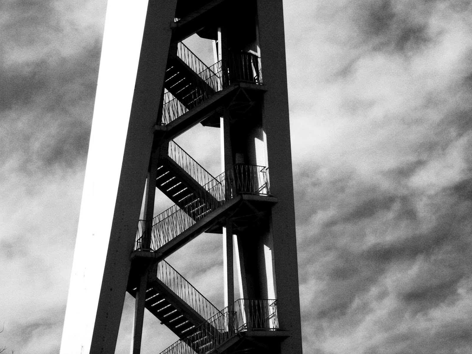
I think the composition in this one works relatively well, with the detail in the bottom and then blank expanse of sky at the top to balance it. The use of black and white and the contrast gives it impact.


I think the saturated effect and the many reflections of light make this photo interesting. This is one of the many laundrettes in Brussels - there's one about every five metres. I also like how lines lead into the middle and really focus the eye to to centre of the image.


Again I think having the large expanse of negative space ie. sky works well in this photograph. This was influenced by a photograph I saw in Aperture a few months ago. I also like the film grain effect.


I think the contrast between vertical and horizontal lines is good in this. The strong orange also really helps to draw the eye.


I like the really dark tones in this. I was interested in it due to the contrast between the ornateness and curves of the gate, and the squareness of the building behind.


Slightly different angle this time. I like being able to see the sky at the top. The sepia is good as it makes it look very timeless and classic.


I don't think the composition in this works because it seems a bit too cluttered and doesn't focus the eye enough.


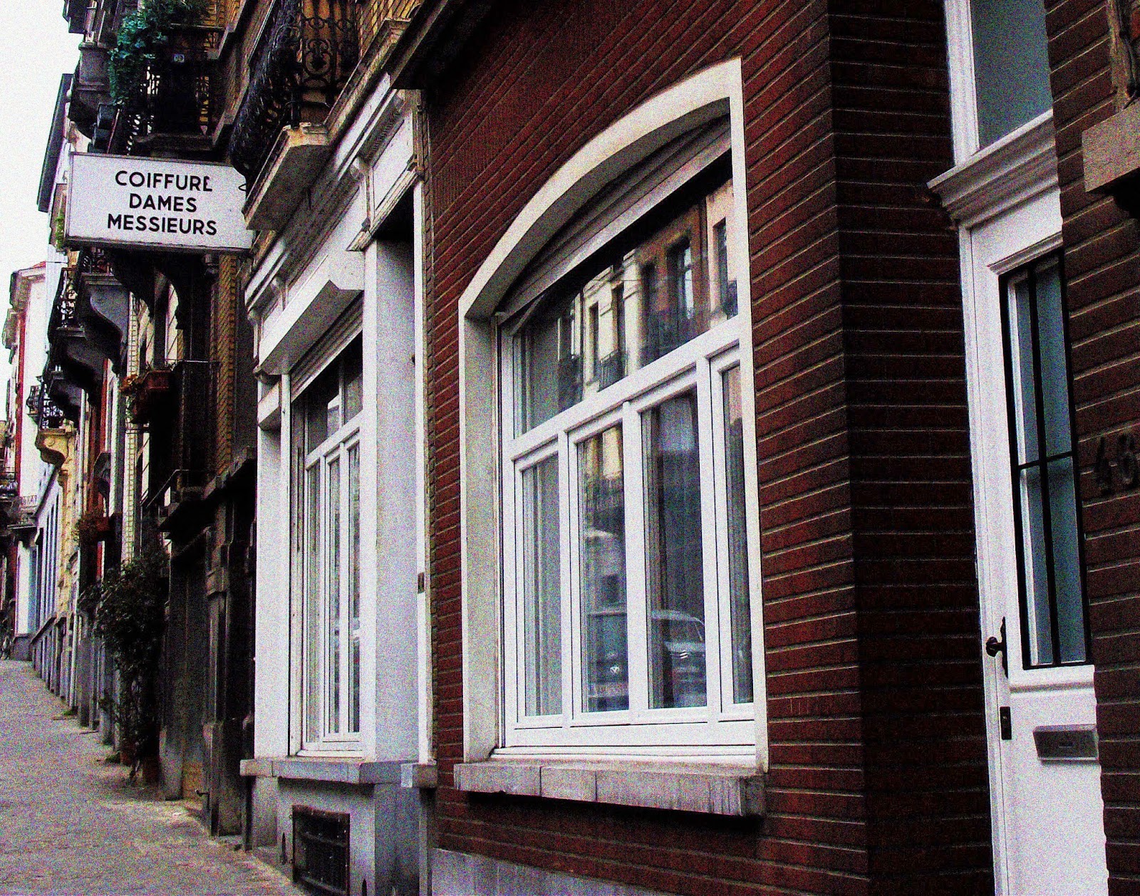
This isn't a very good photo but I like the houses.


I feel this picture works well because it looks very classic and vintage. I'm not sure about the composition though.


The strong orange really lifts this photo. I also think the square format works well.


I really like the colours in this, especially how the guy's jacket matches the door behind him.


I had the camera on my knee, trying to surreptitiously take a picture of those guys outside the Brasserie having an altercation. But I really like the line of bikes in the foreground.


There is really colourful graffiti everywhere in Brussels.


The bold red works well here. I was just trying to take a picture of the shop when this woman walked into the shot which was awesome. 


Joe looking moody and pensive in the Bois de la Cambre. I don't really think the contrast works well in this.


The mixture of reds, blue greys and mustard yellows here looks pretty good and adds a sense of order to the photograph.


The strong blue and yellow against neutrals looks good in this. I'm not sure about the film grain though - I think it looks a bit artificial.


Composition here works well. Also think the saturated colours are nice.


Wanted to capture the contrast between the neon in the window and the greyness of the rest of the image. Other than this though it's not a hugely interesting image I don't think.


The strong colours in this are good. I think the lack of focus actually adds to the image.


I really like how the eye is focused towards the figure in this image by lines converging towards her.


Bit slanty which I don't think is great but I think it captures the feel of the commute.


The strong bright colours are quite nice in this. I like how it takes you right into the heart of the action. It reminds me of this image by Tom Wood. It's a bit overexposed though.


This image was inspired by the paintings of Edward Hopper. I feel I've sort of captured a similar atmosphere to that of many of his artworks. I like the contrast between areas of dark and light.


My favourite thing about this picture is that the man and the dog are both looking back in my direction. The colours are quite rich too which I think is good.


I like the really bold graphic lines of the building contrasting with the tree branches. Also the blue of the sky contrasting with the paleness.


The length of this image gives an impression of height. I also think the strong saturation works well to bring out the colours.


This image was again a bit Hopper inspired. The composition was also inspired by some images in the photo-book Road and Rail Links Between Sheffield and Manchester by Adam Murray and Theo Simpson which I saw at the Sheffield Millenium Galleries Printing Sheffield exhibition earlier in the month. I really think the wide expanse of sky taking up much of the image works well.


Tourists at Mini Europe. I just really like their expressions. Also I think the curve of the buildings in the foreground works well compositionally.


The Atomium is amazing! I just think the composition of this image works well, as well as the blue of the sky contrasting with the silver and white.


The contrast between the grey and the bright primary colours works quite well.


I think the composition of this is pretty good. I also like the saturation of the colours.


I like how abstract this photo looks as well as the strong contrast.


I think the soft focus of this gives the impression of movement. The slightly muted colours are pretty nice. Possibly bit of a boring image though - not really anything to focus on.


I love the flash of bright colours in this one, as well as the reflections and the grain.


The soft focus and saturation, as well as contrast between dark and light makes this image interesting for me.


I'm not sure about this one but I like the bright pink and bright blue.


This one has gone all sharp and horrible but I think the composition is okay. I think the colours could do with being a bit richer.


It was a shame that this car was in the way but these skulls are really cool.


I think the grey and dullness actually works really well here at creating a certain atmosphere.


Windowsill ornaments - I think the high saturation here is good as it brings the objects to more attention. This image strikes me as a bit Martin Parr-esque. I want to have a look at his work.


I think the bright, strong blue of the sky contrasts well with the creaminess of the building. I feel the composition really gives an impression of the fact that this was one hugely tall building in an area when everything else was built much lower.


I really like this image. I think the saturation makes it look really retro and atmospheric, which was the effect I was aiming for when I took it.


The tourist area. I like how the image really focuses on the woman in the middle but then there is also a lot to look at behind too.


These two guys were taking each other's picture in front of the horse. I feel like I captured their interaction well.


The Police stroking the horse. I don't really like the lady with the pink coat in the foreground as I feel it distracts the eye away from the rest of the image.


I think the graphic lines in this one work well. I also like the blue tones.


Anyway that's about it! That's kind of a lot of photos I know.