Wednesday, 26 March 2014

Developing observation drawings on Photoshop

Inspired by how Olivier Kugler draws and then later adds colour digitally I wanted to try adding colour to my drawings on Photoshop. These are just some quick (and not very neat) experiments at doing this.


Morrisons cafe drawings. I think using a few select colours really brings out the atmosphere. But having large areas of strong colour can look a bit oppressive. I've noticed Kugler generally tends to stick to adding colour to smaller details. I should probably look at doing this.


 Vintage London bus. I think leaving the white negative space areas works well as it stops it from looking too much. I like the black accents as well as they seem to add depth.


For this one rather than Kugler I was inspired by Sami Kronk and her drawing in white on a coloured background. I think it looks okay but messing around with the colours has had a negative impact on the line quality.

Tuesday, 25 March 2014

Printmaking

This afternoon I've been in the printmaking room starting to develop some of the images from my sketchbooks. I wanted to do printing as its kind of outside of my natural comfort zone so it could be interesting. I also wanted to push myself to work with block colour so printmaking was a good option. 

I like in this one how the ink is quite thin so you can see through to the images below. I think it could do with some development though as the composition doesn't quite work at the moment. I'm going to try some bypass printing with the photocopier on Friday.

I really don't think this one works as there is far too much black involved. The composition is also kind of messy and not working for me. I do like the different thicknesses and shades of ink though as it adds interest.

This one didn't quite print correctly on one side. However I think the mix of stripes and circles works well. I quite like the selective colours although they kind of remind me of pirates. I want to try and work back into this one too.

The simplicity of this one is quite nice. I like the orange as it looks happy and like a sunset. I might just leave this one how it is as I feel adding anything might spoil its appeal.

This one is my favourite. I love how the bold stripes interact with the lettering and collage. The red contrasts well with the black. I'm going to take photocopies and try working into it with some black ink.

iPod photos

Photos from Sunday afternoon. I wanted to take some pictures with my iPod because many people now use this or their phones as a form of every day documenting. I'm talking snapchat, Instagram etc. So I felt using such a ubiquitous medium could really communicate the theme of every day life. What I want to do next is try and make it more interactive to mirror the ideas of social media in our every day lives. Perhaps getting friends to use their phones to take pictures of what every day life means to them and then sharing them.


What I really like from these is the moody sky. I think it has a lot of impact. I also like how bright the colours turned out. They give an impression of what my walk was like.


Monday, 24 March 2014

Observation sketchbook highlights


The doctor sent me for a pregnancy test because I complained of a sore throat. I think the mix of image, text and background looks good together as well as the mix of line thickness and the colour combinations. This page was inspired mainly by David Fullarton's work (see example below).


David Fullarton.


(mine again)

This one also took influences from David Fullarton's work - particularly how he often makes lists and that his work is very personal to him. I'm not sure if I like this page but the mix of backgrounds and media is interesting and different to how I would normally work, which is good as it will stretch my abilities.


 This page is pretty surreal and I'm not really sure what was going on here but it's also kind of Fullarton-esque. I don't like how there is no drawing involved though.


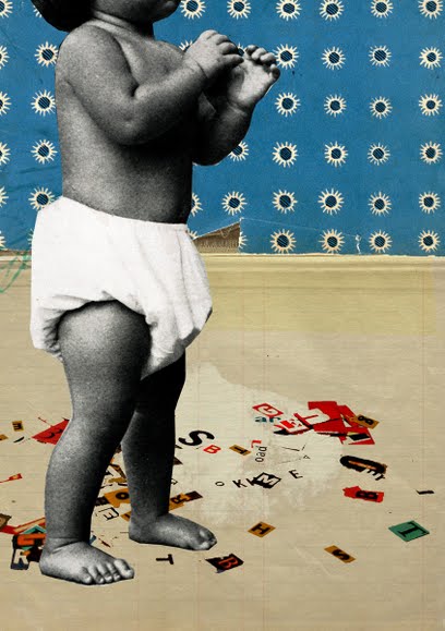
Here I was experimenting with collage inspired by the work of Michelle Thompson (see below). I wanted to make it look really bold and fill the page since this is a way in which I'm not really used to working with collage. I think the effect was pretty good. My main problem with collage is that it doesn't seem to me very original or personal. So I want to try using it in combination with my own drawing and writing.

Baby Steps, Michelle Thompson


This is a quick sketch of the Atomium. I think the black lines and spheres contrast well with the pink stripes. This combination was inspired by Cycling in London by Anna Steinburg (below). I want to try a similar thing using watercolours and black ink.


Lens°ass Architects at Mobilia, The Atomium, Brussels

The exhibition Mobilia at the Atomium in Brussels features the work of thirty Belgian Architects from the past hundred years, specifically their work with furniture and home objects. The piece that really interested me was the table and chairs by Bart Lens of Lens°ass Architects. Designed in 2008, it is formed of MDF, plywood, steel and second hand chairs.


I really like how it adds a new spin on a very classic table and chair set-up. It adds a note of almost Alice in Wonderland style surreality and subverts a well known and very mundane item of furniture, making us look twice at it. This idea of subverting the every day is one I want to look at. This is why I feel this piece is relevant for me to look at in my project.
As well as this I think it is also very aesthetically pleasing, with the chunkiness and solidity of the table contrasting with the delicate appearance of the already existing chairs.

I then went on to look at more of Bart Len's work on his website, objetb'art. My favourite piece from those shown on the website was the °led on fire, a hanging LED candle which also burns as normal. I like how they have subverted the original archaic idea of a candle by hanging it up and passing a current through it. Again this is a great idea of how an every day object can be evolved and looked at differently. We get so used to every day objects that often we wouldn't even consider changing them, but as seen here, it can have an interesting and beautiful effect.

Brussels videos

These are just some videos from Belgium which I took to try and capture the atmosphere of scenarios that I was in. I think that being able to hear the ambient noise really helps to build up a stronger picture. My favourite is the last one, where the accordion players are in the underground station, because I think it really builds up a strong impression of Brussels and is quite quirky and unusual.


London Underground

I forgot to upload this video from my trip to London the other week! Here it is.


I think it's quite a cool, quirky little video. I like how it just gives a little snippet of the event. I also think it's good how still I managed to keep the camera. I think this could be good with some kind of weird elevator music in the background or something. I might try that later if I get the chance.