Wednesday, 7 May 2014

Library Research

I found this article interesting because like my project, it relates visually to houses. It has a great sense of nostalgia. I'm inspired to try working in a 3D installation kind of way. Although I don't have the space to build a real size house, I might use a dolls house. I need to work out a way to do this.


This image attracted me because I liked the texture of the photograph projected on the walls. This subverts the idea of wallpaper and really builds an immersive atmosphere. Turning it upside down adds a surreal and unexpected effect. Again to explore a similar thing to this I need to try working in 3D. Perhaps first just using a shoe box or something.


I liked how Jen Moules has used stitch in her otherwise flat print work. I've been meaning to use stitch in my project and have only touched on it briefly, but this has reminded me to pursue it! I'm going to use stitch to work into one of my patterns.


Relating to my exploration of the themes of ambition and regret that I have been exploring, I found a book called 'It's not how good you are, it's how good you want to be' that I felt was interesting and relevant. It's a kind of self-help book for aspiring creatives set out in a very striking and graphical way. The design itself is inspiring as well as the messages behind it. Sticking to a black and white colour palette and bold headlines gives it a simple look and informative appearance. I also wish to use text and inspiring messages in my work, and this has shown that using boldness, straight talking and limited colour palettes will be effective.


I also looked at this book on fortune telling as it relates to the idea of destiny and brings up questions of whether our future is predetermined. If so is there any point having ambitions because what will happen will happen? Questions like this. I think this would be an interesting idea to explore and could be taken a number of ways - for example following your destiny, or overcoming your destiny, uncertainty etc. I also think tarot cards are very nice visually.


Adding text to image

Yesterday I did a print from a thumbnail I designed. Then I was adding text to it according to the design.


I felt the cut-outs worked well but I didn't like the text in pink as it makes it look a bit cluttered and messy. As a result I tried the text again with just cut-outs.


I think this version looks slightly better as it looks more coherent. This shows how if something isn't working well, it's good to go back and try again.

I then combined this print and one of my previous ones into another pattern.


I'm enjoying doing these house prints but I think I need to take it further as it's getting a bit repetitive.

Friday, 2 May 2014

More pattern experimenting

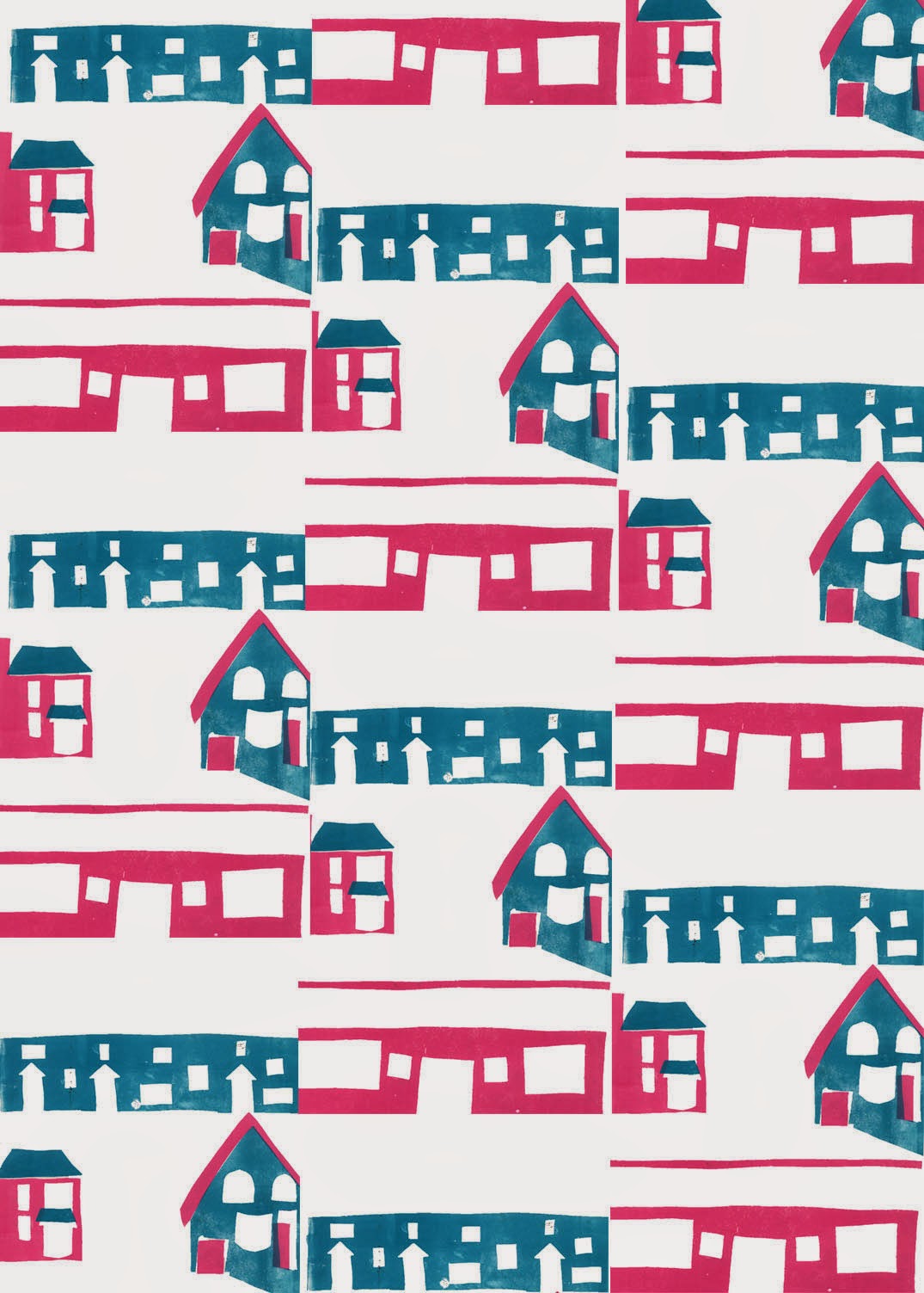
After trying out the first of my thumbnails I realised that I needed to incorporate far more negative space, so I tried making a print of a different one of my thumbnails that I felt would work better. These are the results I got from it.

 The blue and pink design on the left is the original two colour mono print, the blue sheet in the middle is the actual stencil I used, but thought looked good and that I should work further with it, and the design on the right is the original with text added to it.


This is the repeated pattern made of the original. However I felt it was a little boring in its current state and didn't really like the colours so played around with different effects on it.


 I think that this black and gold design works well because it looks quite rich and ornate. It adds a very decorative feel to the pattern. It's very dark but I think with the gold this isn't a problem.


I then tried simplifying the shapes of the design and modifying the colour palette. I like these red and green colours together as coupled with the design they remind me of rose buds. As a very stereotypical suburban theme being rose bushes, I think this works well contextually.


 I then inverted the black and gold pattern, and added a diagonal criss-cross effect. I think this works well as it is a very classic kind of wallpaper pattern, but given a quirky twist by the houses. I'm a big fan of the blue and white combination as it reminds me of willow pattern pottery (another link to the domestic). The criss cross pattern balances the image.


 I then put the chrome effect on the previous image. I think it has a very cool and subversive effect. It preserves the criss cross pattern whilst distorting the images themselves. This could be representative of the idea that in life the views we have of other people and situations are often a distortion of the actual truth.


 This is another distortion of the blue and white criss cross pattern. I think it has quite a retro and cute effect, with the shapes looking like flowers. Again I think it works well having distorted the original design but still kept elements of it.

After this I took the original blue and white design, added a background, and then played around with different colour ways. I think they all worked pretty nicely. They have quite a classic look to them.


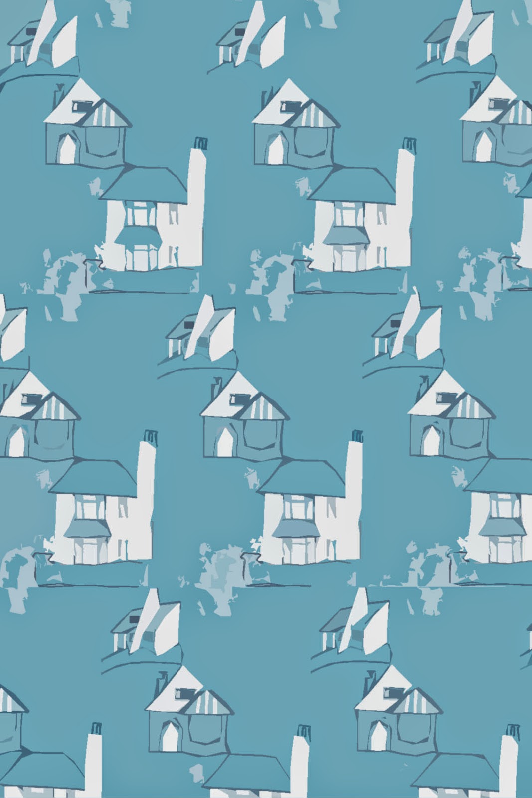
Next I tried working with the blue stencil print which I had scanned into the computer:
 I think the contrast between the blue and the white works well. The image seems to have an appropriate level of negative space and keeping it just blue and white is nice and simple. So instead of changing up the colours I concentrated on developing it through adding texture.


 This lighter and more patchy shade of blue also works nicely. It has a brighter and more uplifting effect. The patchy texture adds interest. I then took this and simplified the shapes (see below).

 I think this looks quite vintage and 1950s with its bold shapes and lines and cutesy appearance. I think the shade of blue is nice and atmospheric.


This textured version is I think really effective as it gives the illusion of destruction and decay. It adds a dark theme to the image.


I then added another texture and ended up with this (above). I really like the scratchy effect making it look rough and imperfect. I think it would work better in blue but I couldn't work out how to do this oops.


This was from taking the original and pointillising it. I love the effect this gives. It's abstract and reminds me of ripples in water. It has a very pretty look. It really adds a twist to the original design.

Finally I worked on making the edition with text into a surface pattern.


I think the addition of text (which was in the individual design thumbnail for the images) really adds to the design. It makes it look much more balanced and interesting. I'm still not the biggest fan of this colour scheme so I played around with it again. I didn't want to distort this design too much as I wanted the text to still be legible.

 This colour option is much brighter and more vibrant. However it was quite hard to edit the colours so the effect is a little messy. I think it's still good however because it does add more vibrancy to an already playful image.


This all black edition looks very striking. I think the slightly messy, inky look works well in this case as it seems very organic. I do really like the boldness of this version.


I added a glow tool to the original pattern to get this green effect. After playing with the hue, I also liked this pink version. I think it works well having the houses in white against a coloured background. I then changed the colour of the pink one's background and played with hues again. I think they all look really good.


I then wanted to try a cooler background (see below). I think the contrast between the grey and red really works. I then increased the contrast substantially (second image) and I think the outline effect is very bold and works well.


In conclusion I think I came up with some really nice results. Paying more attention to negative space really pays off. 


Tuesday, 29 April 2014

Print experimenting


 This morning I was working on these prints so that I could create a repeating pattern out of them. This is to show the monotony and repetition of suburban life. I printed the pink first then added the blue over the top. I quite like the random effect where some of the colours overlap.

I then scanned the finished print into Photoshop and experimented with it.


Here it is in its original colourway. I think the simplicity of the shapes works well but there is not quite enough nagative space, making it look quite busy. I felt the colours were too dark and dull so I brightened them, as seen below.


I think this gives a pretty effect although would work better on a pure white background (which it actually has but Blogger has messed the colours up). Having the colours lighter and brighter makes the image look less opressive and busy.


Here it is once I added a tile effect. I think it works well as it looks remininiscent of Victorian sewing samplers which adds to the homely and familiar atmosphere.


 Just two more experiments with different colours, although Blogger has utterly messed them up so that they're almost unrecognisable.


Given that the problem here is lack of negative space, I'm going to work on a different one of my thumbnails which will incorporate much more negative space.


Monday, 28 April 2014

Surface pattern experimenting!

Today I was working with some of my existing prints to make patterns by scanning them into Photoshop, and then playing around with them. They were inspired by 1950s fabric prints. Here are the results.

This is the first I tried. I think it doesn't work hugely well because it's too busy and there's a lack of negative space. I need to remember to factor in negative space in my later prints.


Then I tried changing the colour of the one above. I like this colour scheme too because it is very vibrant and bold, and quite pretty.


I then developed this by distorting it. I like the effect this gives because it is pretty and reminds me of blending ink. It also reminds me of Ted Baker prints which is always a bonus!


The next pattern I made was this. I think this works better as it has far more negative space. I also enjoy the simplicity of the shapes. I get a really kitsch 1950s feel from this print. I think the colours are good because they seem very happy and vibrant. However I decided to try experimenting with colours to try different effects.


I manipulated the colours to get this outcome. I think the blue is nice but the black is a little oppressive, although I really think the selective palette has a very good, simplistic effect. As a result I tried replacing the black with white.


I think this also works well, with the lighter feel looking fresher and less gloomy, however I wanted to add some subtle colour in the background.


I think the pastel blue and yellow look sunny and retro together, like the effect I was trying to create. However I wanted the image to look even  more simple, to become more striking and abstract, so I simplified it.


The muted blue scheme reminds me of Dutch pottery design. It has quite a calming and serene appearance. I think the simplification and abstraction adds to the 50s feel.


These were just playing around with the hue. I think keeping the colour muted is good as it looks calming and retro. The simplicity of the shapes is nice.


The final print I made was using a similar starting point - ie. the same print but a different edition:

This is much bolder in colour scheme. I think it does work well but is a bit busy, and the first variation I did works better.


I used the 'glowing edges' effect to simplify the image. I like this but I think the colours are a little bit clashy. As a result I took the colour away to leave just white lines.


I really like this effect. But I thought if used in large doses the black could again look too oppressive, so I tried inverting the colours.


I think the sketchy effect looks cool. It's very simple but still obvious to see what the subject is.


I also played around with the colour of the original to see what just one colour would look like. I think this has a nice effect but that the original colours complementing each other work better, as it helps to differentiate the different areas of the image. So to finish, I just experimented with the hue of the original image.


These colours seem really vintage, striking and 50s to me which I think works great. They also add a sense of unreality and quirkiness which I like.


My next step is to design a new print design specially, bearing in mind what I've learnt from this exercise. I'm then going to mono print it.