Friday, 14 March 2014

Serco Illustration Prize 2014

Yesterday we went on a trip to London with college. Because of my theme of 'The Every Day' I felt it would be useful to visit the London Transport Museum, and in particular the Serco Illustration competition there. These are illustrations which intend to represent ordinary London life so I felt it would be relevant for me.

There were two pieces that stood out for me, by the artists Anna Steinberg and Sonia Poli. After researching their work further I've found even more to inspire me!

 The Great Fire of London, Anna Steinberg

I love the limited colour palette of this piece, the block orange of the flames contrasting with the white of the paper and the black of the pen. It's stylised but extremely evocative. The mix of flat, bold watercolour and delicate scrawling pen works extremely well, as does the portrayal of text by both typewriter and contrasting handwriting. I love how full of interest the page is whilst still leaving quiet areas. There is so much to read and look at and it builds up a very thorough picture. This strikes a chord with me because I like to write all over my work too.

After researching her work further I found that she's entered the Serco Illustration Prize before. This one was from the Year of Cycling and is my favourite of the others.

Cycling in London, Anna Steinberg

Again I love the contrast of the boldness of the watercolour and the delicate pen work. The use of one colour and black really works well so perhaps this is something I should try. The composition is also great. I love the person's head just coming in on the bottom!

This next one is from her personal work. I really liked its energy and intensity.

Modern Willow Pattern, Anna Steinberg

I love this twist on traditional willow pattern. Unlike the traditional calm pastoral feel of willow pattern you can almost feel angst seeping from this. Again the combination of text and image is something I like. Painting on a paper plate is really imaginative and quirky and also creates an interesting effect as you have to work circular rather than on a rectangle as expected. I want to try and work on interesting materials like this. It feels like a very personal artwork.
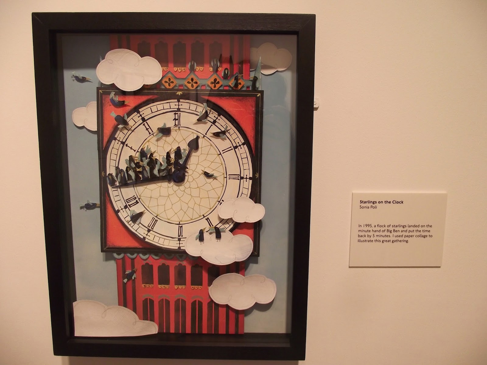


Starlings on the Clock, Sonia Poli

Sonia Poli's work was another that I liked in the exhibition. I love the 3D paper modelling of this piece. It builds up a really evocative picture and the shadows cast really add realness. It's also a pretty funny story. The limited colours and bold shapes work well. I'd really like to give some 3D paper work a go. I wasn't really a fan of Sonia Poli's other work though, when I researched it online. It's very much graphic design based which isn't so relevant for me. Also her website was horribly confusing and difficult to navigate!

Wednesday, 12 March 2014

Blossom pics

Life is cute so here's a bonus round of some pretty blossoms.


Tuesday, 11 March 2014

Station films

Visiting the Interactive at Sheffield preview at Sheffield Millenium Galleries and seeing video used in a gallery setting made me want to experiment with video myself. Here are my first attempts. It was very much inspired by this animation here by Julian Opie (take a look!), which I saw in the Millenium Galleries about two years ago.


I was just sat with the camera balanced on my knee trying to be inconspicuous again, hence it being a bit shaky (and on a kind of ridiculous slant). Maybe I should use a tripod in future. Then again I kind of like the shaky effect as I feel it makes it seem more organic and fluid. The other main problem I have is the limited quality that my camera can provide. However I could potentially borrow better equipment from photography if needed.


This one I think works well, if a bit too long. But I think it's important to have the train arriving and then leaving. It can also help to reflect the boredom and frustration sometimes felt when waiting around for trains to leave. I think it also reflects the character of the particular station well - quiet then madly busy, then becoming quiet again once the train has left.

I definitely want to look at taking some more videos.

Photos from sunny Chesterfield

Then yesterday afternoon I ventured out into Chesterfield to take some photos with a similar strategy. It was such a beautiful day so I'm glad I went out.


I took this photograph because I was attracted to the bold repeating shapes. I like how the very dark areas contrast with the white of the clouds. The bendy spire in the background is also a bonus.


I love all the boldness and sharp edges in this as well as the contrast between the red brick and the blue sky. I think in some ways the image is quite unsettling due to the broken window and odd telegraph pole or whatever that is. Anyway I think it works pretty well.


I was attracted to this because of the boarded up window and hadn't even noticed the two little old ladies walking past. I'm not sure about this image though, it's perhaps a bit boring. But I think it's more interesting for being in the long strip shape rather than just regular proportions.


I really think this image works well, in fact it is one of my favourites I have EVER taken. The colours, composition, text on the van and glimpse of the market in the background all work together to create a good atmosphere. It really gives the impression of a lovely sunny day.


I don't know if this really works compositionally but I love the colours and the flowers are pretty so there ya go.


I like that there is a lot going on in the image and how the window and door frame it. The composition works well but I think the colours don't really. There's too much beige going on.


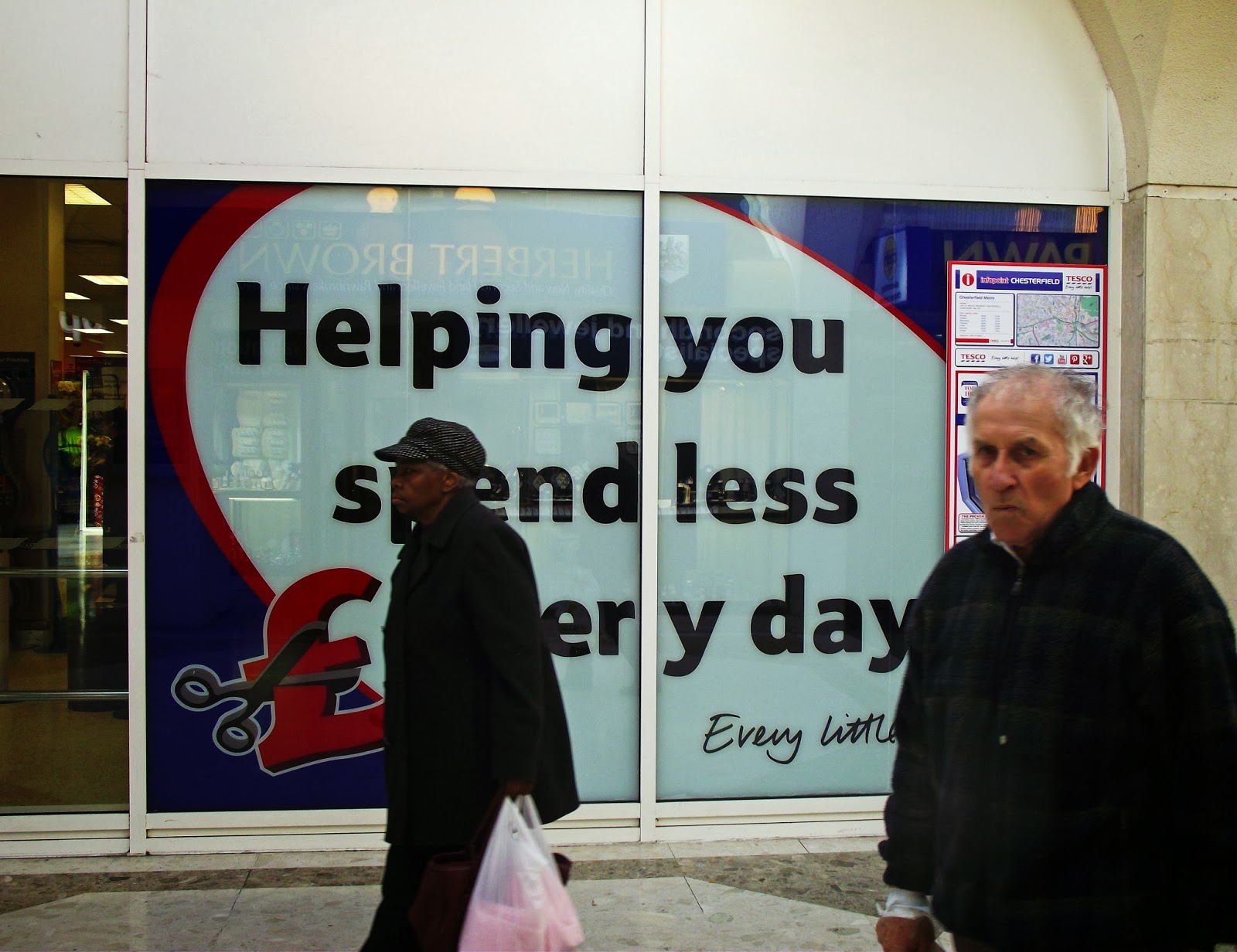
I was just taking a picture of 'helping you spend less every day' because um every day. But then these two randomers wandered through my picture which was BRILLIANT. I love the old man's sour expression. It turned out way better than it would have been.


The lighting in this isn't great but I like the composition and some of the colours. It captures a lot of people just doing every day things.


I think the colours and the graphic shadows in this work well.


So anyway that's what I got up to.

Photos from College

Yesterday I started taking some observational photographs of things I found around college - just anything that interested me or seemed relevant or quirky. This was good as a way of generating new and different thoughts and ideas.


Gold man - I just thought that the drawings on the mannequin and also the selection of weird objects looked pretty odd and funny. I quite like how there are a lot of broan and gold tones which contrast with the coolness of the wall colour. I think the composition works quite well.


I found these two examples of funny annotations that students have done on whiteboards in some of the art studios. I like the idea that these objects intended for a serious purpose have been appropriated like this. I also like how clearly a number of different students have added their inputs to them and the outcomes have grown quite organically, quite like a game of consequences.


This was a very spontaneous image of Chloe collecting her work from the print room. I really like the sense of light and movement. Photographing people usually looks way better when it's natural and not staged or contrived.


Dirty pots in the studio. I just really like the deep colours and contrast between the stripes, circles and ink splats. It's quite a chaotic image but I think this works well as it reflects the chaos that is our art room.


Another one of Chloe. Again I like the sense of light in it. I also think it works well how the blue of her top matches the blue of the fish in the painting, and the red of the painting matches to my bag in the bottom of he image. It adds a sense of coherence. I also think the pose Chloe was in works really well. The eye is drawn towards her, the focus of the image.


I managed to get this photo of Iona without her noticing me, deep in thought. I love her expression because it makes her look like a miserable Victorian sitting for a portrait. I also like how the light comes in on the left hand side. Also the texture of her hair looks good.


Roisin and Vince eat cake: These two photographs are intended as a series. I think they're quite cute and funny but not compositionally great. Also the colours have come out very dull and monotone which I don't like.

Taking a walk


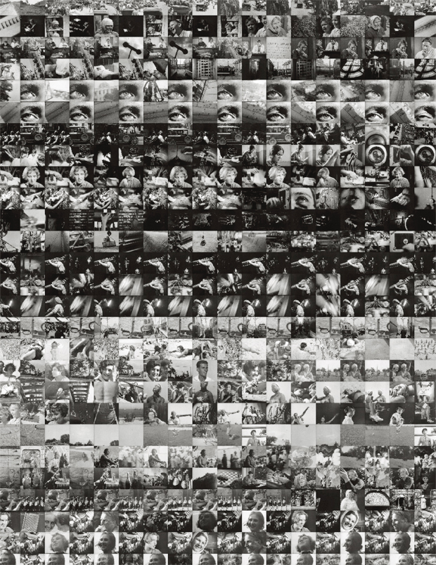
This is a series of photos I took from a walk across the college canvas. This was inspired by images I had seen in Aperture Magazine (Issue 214) which you can see below. I wanted to get the same effect of rather than just being a stand-alone, regular photograph, to create more of a journey or story. Most of the individual photos on their own are absolute garbage (I was shooting from the hip, trying to be inconspicuous), but I think that together they work well as they link to one another and build up a picture of the experience. In future I think I need to consider the composition of each individual photograph more.


Left: Chris de Bode, Exodus from Libya, 2011.
(From foam.org)

Right: Jay Chow and Lev Manovich, Every shot from Dziga Vertov's film Man With a Movie Camera (1929), 2012.
(From Aperture Online.)

Sunday, 9 March 2014

Drawing Experiments

This week we started our Final Major Project which is super super important and even more super stressful. On Friday we had a drawing lesson to just start us off drawing more experimentally and generating ideas. The theme of my project is 'The Every Day' so I was working with drawing every day food packaging, inspired by John Bratby's Jean and Table Top (1953-4) which I saw in the Grave's art gallery this week and includes branded food items to give a sense of realism and normality.
We had to make drawings and then work back into them, ripping up and reconstituting, and then developing in other ways. It was important to use a lot of different media and we were working to short time limits (like 2 minutes to a drawing).
Anyway forgive the horrible quality iPod photos.


I like the way the black ink looks on the brown paper and also the touches of blue in this one. I don't really like the pale patch though; I think it's too big and distracts from the overall image. I could think about masking some of it in some way. But I think the mix of different textures and materials works well as it adds interest.


This one is made out of lots of different elements of drawings put together. I think it's ended up looking a but too busy and cluttered. In future I could work on leaving more negative space and considering the composition more. The colour scheme I think is interesting though because it's not colours I would normally use. I also used some mathematical tables as background material which I think adds a good texture and unexpected element.


 I did this one on a long thin strip of paper really small, because I usually work pretty big and wanted to add some variation. I really like the colour palette of this because it's very limited but effective and cute. I'm really pleased with how it turned out. I want to try working on a small scale more.


This is a development of the previous image where I've photocopied it repeatedly to make a pattern. I think it works pretty well although it does look quite abstract. Again the colours are pretty good and I like the contrast between the bold stripes and thin lines. I'd like to do some more work with pattern later on.