Sunday, 30 March 2014

Photos from yesterday

Just some dodgy iPod pictures from my lil outing yesterday.


I like that the perspective and composition in this one is a bit unexpected.


I thought the combinations of the camper van, washing line and compost bins looked cool and very every day.


This is horribly overexposed but I liked the perspective.


Jess had some flowering tea! It's kind of like a twist on the every day.


Series from a florist.


 Jess looking Pre-Raphaelite with her Mothers' day flowers.


Charity shopping.


Friday, 28 March 2014

Image developments

This afternoon I've been taking some of my print work and developing it further through mainly collage. The main aim was to simplify them down a little to add more negative space and make them look better visually. Here are the results.


I think the amount of negative space here works well as it looks simple and clean and gives the details more impact in comparison. It's very much refined compared to the original. Adding the splash of bright pink has softened the entire feel.


This is collaging two elements together with a little bit of ink work. I don't think it works so well as I don't think the colours go together brilliantly. The composition is a bit random but I do like that there is a lot of negative space left.


This is my favourite out of what I did this afternoon because I feel the mixture of materials complement each other well. I also think adding the blue accent colour has really lifted it. The layering adds depth to the image.

Update on bypass printing

I tried it one more time. Again it went completely wrong and nothing like I wanted it or tried to achieve. I hate the extent of the lack of control it brings. I think I can conclude this is not the method for me. Plus it costs $$$ in print credit so it's probably for the best.


At least I tried.

Bypass printing development

This was one of my prints from Tuesday. I decided to develop it by adding more texture through bypass printing, from existing pages in my sketchbook.


I like how the stripes interact with the images underneath. I accidentally made the scale of the photocopy a bit larger than I was expecting. I think it's good having the line drawing of the Atomium alongside the white silhouettes underneath.


This one went completely wrong compared to how I wanted it to turn out. I had the sketchbook completely the wrong way up so ended up getting the image on its side rather than the correct way up. But in a lot of ways this is more interesting. I don't think the composition really works though. I don't really like how hard it is to ensure you get a desired effect using bypass printing.


Again this wasn't quite how I expected this image to turn out. However I think the texture of the receipt works really well on the background. It looks very ephemeral. 


I got a bit tired of the unpredictable nature of bypass printing so for this one I was just writing over the top of a photocopy of the original print. I think the texture it creates is nice.

I think the main problem with these images is the large expanse of red ad it seems quite oppressive and busy visually. I want to look at taking some of these images and incorporating more negative space.

Wednesday, 26 March 2014

Contrasts

So I was walking my dog around my area and just thinking about how weird some of the architectural and social juxtapositions are. These are all photographs taken of houses on the exact same road but with some big differences between them. Some of the most expensive houses in the city are combined with local authority housing. These are houses that reflect each other while at the same time contrasting hugely. I wanted to combine images together to illustrate this and the different every day lives of people living in very close proximity.

They're just iPod pictures so they're not great quality but at this stage it's more about the idea and the combination of images than the images themselves.

.

I like how the two trees mirror each other in this set of photos. It adds a sense of flow, while the actual buildings are really different to each other. Having the images different sizes adds interest.


I put these two images together because I felt the triangular roofs echoed each other, whilst again the buildings themselves are completely different in style. 


 I took these two because they're both bungalows but completely different in style. They look pretty boring together though.

 These were two houses right next to each other that contrast. However although they are completely different eras and styles, their overall shape and silhouette sort of mirrors each other which I thought was interesting. I wonder if this is coincidence or if it was intended by the architect of the second house. Anyway it shows a kind of coherence through time. They're very grey photos together though.


I want to continue looking at this theme. Firstly by taking more and better photos - probably with a camera this time. I could work towards making a photobook or something. I could also work with drawing houses. As well as this I could follow the idea of contrast and similarity by drawing over the photographs on acetate or tracing paper or other translucent medium so that both aspects can be seen at the same time. I could also try drawing with sewing over the top.


Room photos

I've been thinking about profiling people and their every day lives. I wanted to look at objects or things that can tell a lot about a person, based on Peter Blake's painting 'Footsteps' where it seems that the contents of someone's pockets have been spread out on the floor and documented. I was thinking about the contents of other things that could be photographed to give a similar idea of a person. For example, wallets, bags, cars, wardrobes etc.

After looking at the work of Martin Parr, particularly his collaboration with David Meadows on 'June Street', and Richard Billingham's work photographing his family in their home, I was thinking about how people's home environments and the objects in them can really reflect the people themselves. People's bedrooms in particular can be very personal and give a strong impression of a person's character and reflect their every day life. This led me to the idea of photographing and documenting people's rooms to build up a profile of them. It was also inspired by this article I saw (click here) about childrens' bedrooms around the world, which shows a lot about their individual situations.

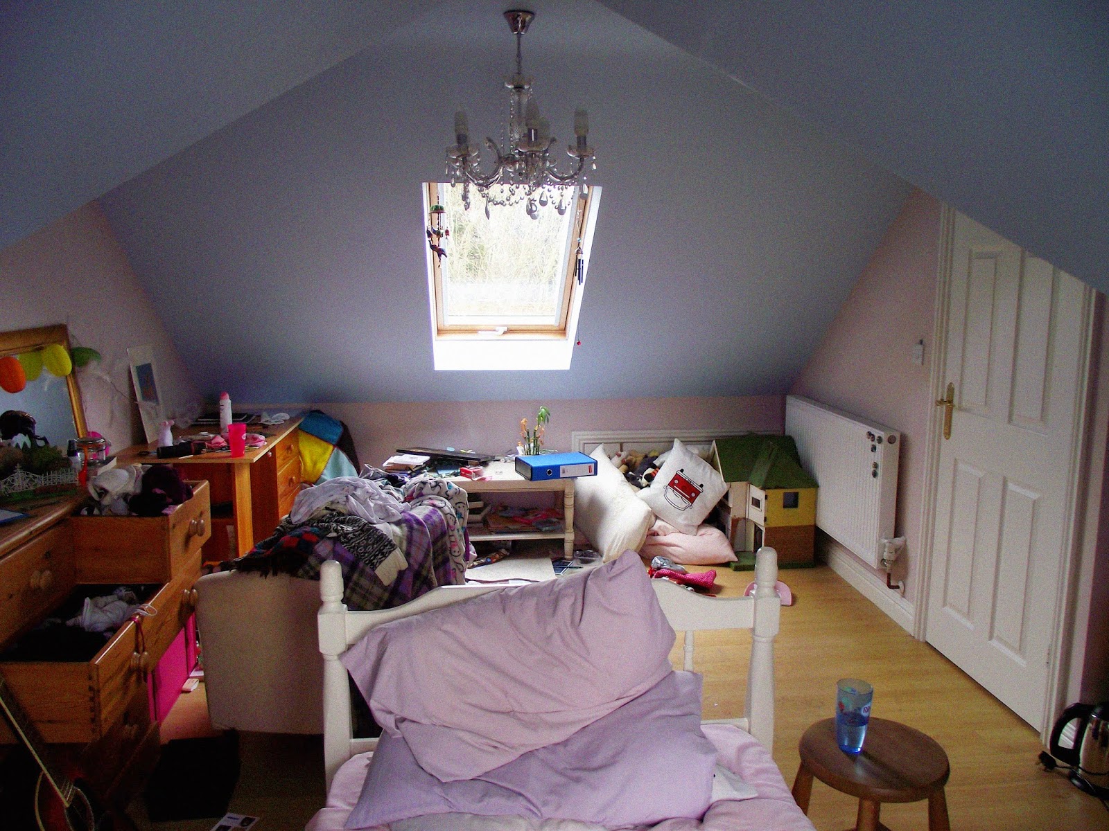
Here are some photographs that I took of mine and my brother's bedrooms respectively. The main rule was not to move or change anything so as to be completely truthful and authentic. I took pictures of the rooms as a whole and then details.


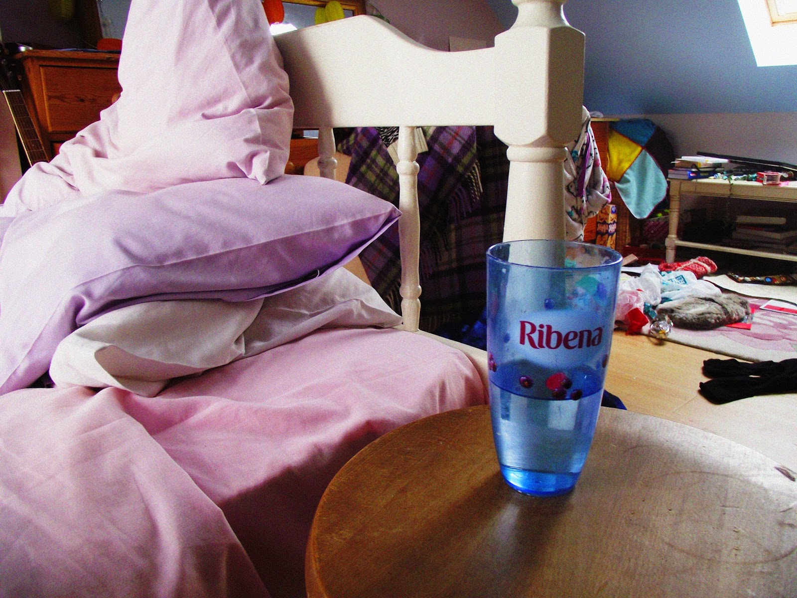
I discovered that I have a large collection of Ribena cups:


Then moving on to my brother's bedroom:


I based the saturated effect of these photos on those of Martin Parr. I was aiming for a richness of colour and tone which I think I pretty much achieved (although Blogger has messed up some of the light levels AGAIN). I think I've succeeded in documenting aspects of our personal lives. Next I would like to explore more people's bedrooms to build a collection and wider spread of images. I'm going to photograph my parents' bedroom next. I suppose having two people having a room would affect the personality of it. I also want to photograph people in their rooms to give an even more thorough representation and better profile of the people in question.